In this next phase of my design process, I have decided to look at subjects throughout the course which have intrigued me and warrant further exploration. The quote that stands out to me the most from all of the lectures I have watched during every module is that of David Carson when he said, “you have to utilise who you are in your work. No one else can do that.” For this project to be successful, it needs to be something that means something to me, has my core values at heart and says something about me as a designer.
Looking back through the previous modules there appear to be some reoccurring themes. I have broken these down into simplified terms:
- Mental Health
- Family
- Pride in Place
- Typography
- Values
From the quadriptych in week one, these things have remained an important focus throughout my studies. For that reason, it makes sense that my final major project picks up on some of these themes. This will ensure I remain inspired by the topic and invest the appropriate amount of time into each phase of the module and will produce something I am proud of.
With that in mind, I started to think of some ideas of interest to me and posted the following to the ideas wall:
“I have been playing with a couple of ideas in my head and keep adding to them as I watch more of the initial lectures. Without going into too much detail at this stage, I would love to hear what you think of them:
1. Positive Mental Health – I haven’t formulated a question surrounding this subject, but I would like to look at how graphic design can be used to show the positive traits of those with mental health. Yes, I have anxiety. But it makes me a fighter, strong and determined to succeed.
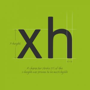
2. Death to comic sans – I have two children – 9 and 3 – and a wife in the teaching profession. Is comic sans the best way for children to learn? It is everywhere in their schooling lives. I would like to research where it came from and what other fonts have been developed to increase learning in younger people.
Any feedback you have will be greatly received. 😊😊”
I let these ideas stew for a couple of days as I wanted to see if they provided sufficient inspiration. I also started some initial research to see if these issues had been tackled before, what outcomes could be achieved and if I felt it would create an opportunity to create something which would have a positive impact on my portfolio.
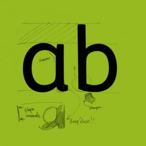
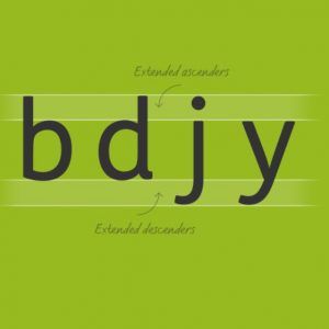
An Educational Font
Following on from the feedback from Lorri, I started to investigate fonts that already exist which try to tackle issues of adversity within education and schooling. I came across the following examples:
FS Me

https://www.fontsmith.com/fonts/fs-me/styles/family
Sassoon Primary:
http://www.sassoonfont.co.uk/fonts/sample.html
![]()
To be honest, it was a bit disheartening to find out that this had been examined by multiple people from differing viewpoints. Of course, finding something unique to investigate will be difficult to find and, given the limitations of the project , it may make sense to push the boundaries of an existing project in an expected way. As Ben Evans James said,
“…..at an MA level, we are unlikely to build an entirely new ladder. However, we can look to see what ladders are out there and help to build a new rung.” – Anna Robinette
https://annavrobinette.wordpress.com/2020/09/29/gde750-week2-litreview/
Positive Mental Health
Havin suffered with mental health issues for most of my life this subject is really important to me. Rightly or wrongly, it has always felt to me that mental health has negative connotations and people think less of people suffering. Conversely, I believe that those with mental health conditions also possess strong characteristics which are sometimes overlooked. Yes, I have anxiety – but I am still here. I am strong, resilient, and determined to be the best I can be.
Unfortunately, Covid has knocked my own personal mental health and, whilst I do think this would be an important topic to cover, I do not think I am in the right place to tackle it at this point of my life. Put a pin it?
So what else interests me?
Right place right time:
As you know, I am a Designer for a Local Authority. The Local Authority covers an area which I used to holiday to as a boy and moved to when I was 8 years old. I love this area, love my job and love the direction it is heading in.
The council recently joined forces with a neighbouring authority to make a bid to the city of culture. Whilst the bid wasn’t successful, it shows the ambition and drive of the locality if which I am proud to be part of.
Great Yarmouth has also been highlighted recently in the media after Banksy visited the holiday location as part of his ‘Spraycation’ series which can be seen here:
The area has an amazing history, culture and emerging arts scene and, as you can probably tell, is something I am truly passionate about. Going back through some of my earlier modules, these projects were great to work on and I feel could warrant some further explanation:
- Ghost Signs
- Typography
- Façade
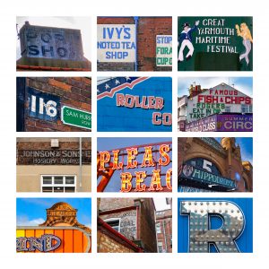
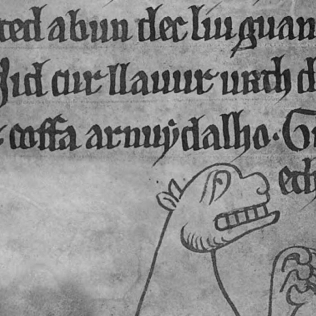
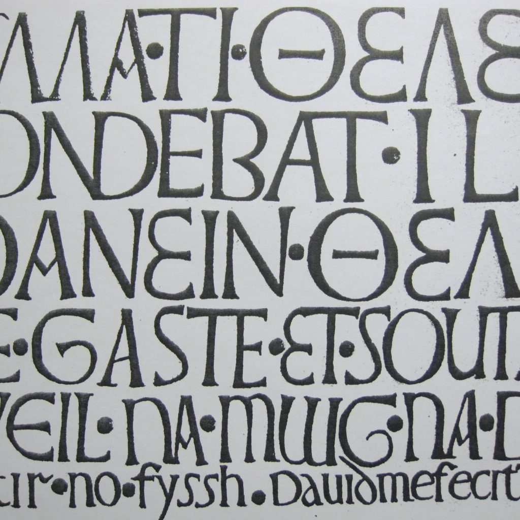
The whole borough has a rich typographical history and continues to showcase interesting and exciting ways to use type. I wonder if certain typefaces have been developed specifically for the Great Yarmouth clientele? Ghost writing, circus, tourism, performance, maritime. How have they effected the use of type today in Great Yarmouth?
Reminds me of this project from Colophon Foundry:
Cymru Sans
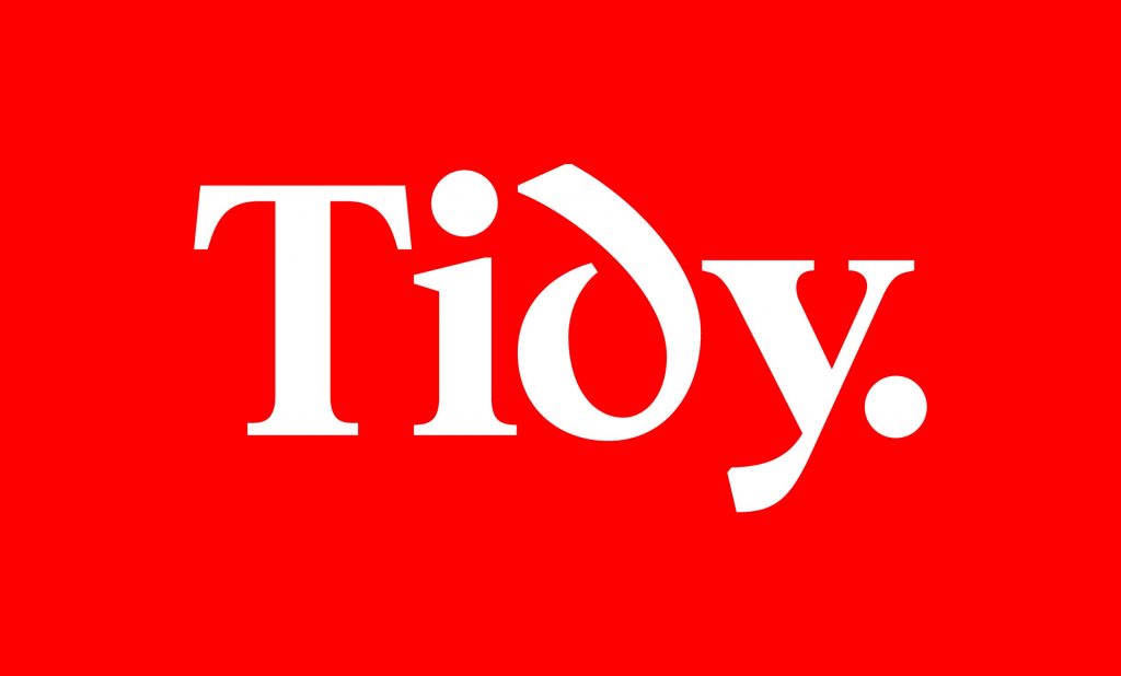
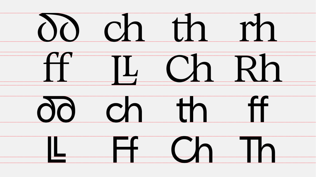
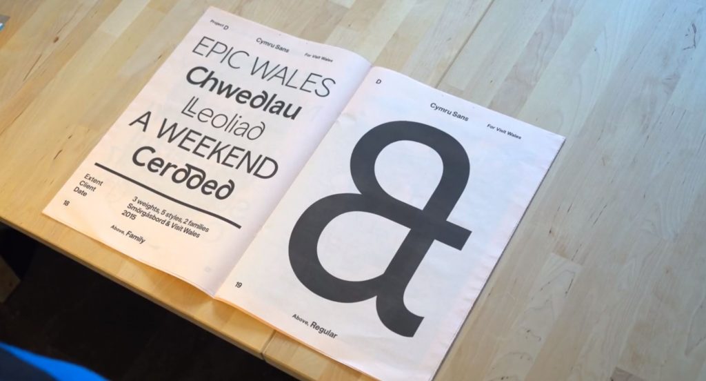
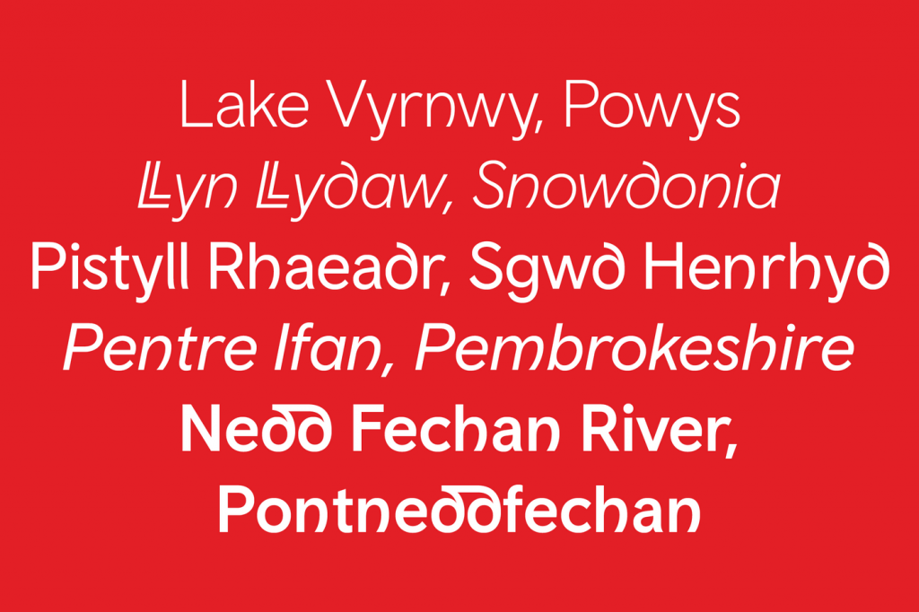
Colophon Foundry created Cymru Sans to “…represent Wales to the world.” They focussed on the provenance and unique linguistic traits of the Welsh language to assist in its production. Cues were also taken from Welsh typographical heritage in attempt to depict a place through typeface alone.
https://www.smorgasbordstudio.com/work/cymruwalestypeface/
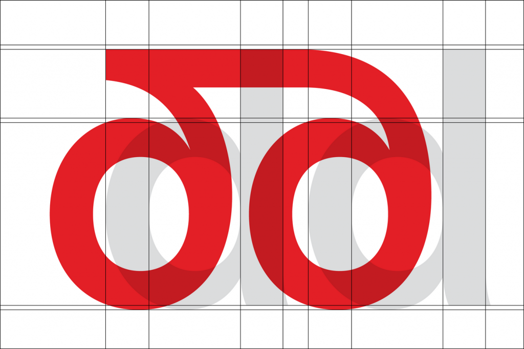
And the Mexico ’68 Olympics
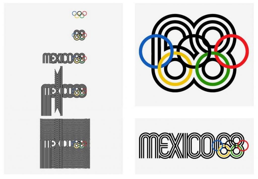
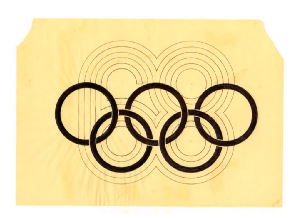
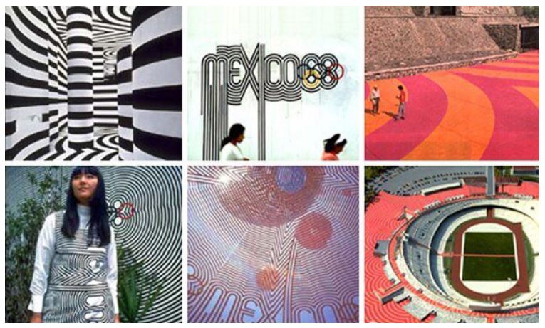
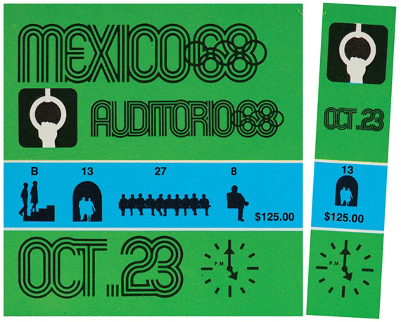
In the 1960s, Lance Wyman created the above branding for the ’68 Olympics. He too used Mexican heritage to create a style that would resonate with his audience but still have the draw of a global audience. The core strategic idea behind this branding would go onto provide the template for everything from tickets to clothing to stamps and icons.
Other typographical projects which have interested me during the modules include that of –
Anthony Burrill
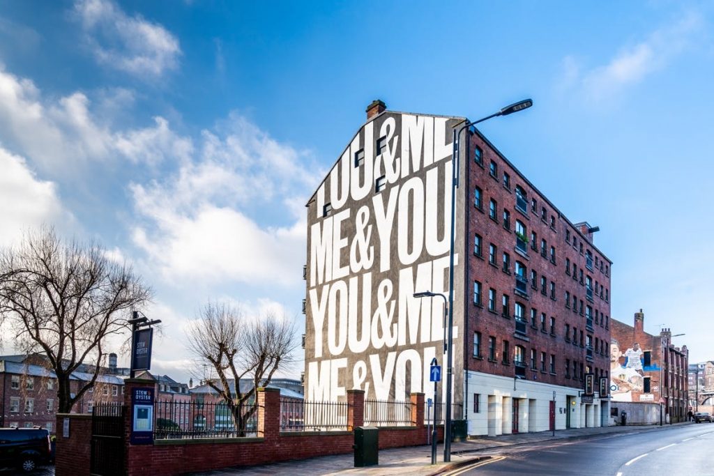
Anthony Burill describes himself as being from the analogue era. Born in the 1960s he journey through design meant he encountered techniques which may seem dated now – letterpress, photocopying and stencilling.
Computers were only used by Nasa when he graduated which meant he utilised tactile approaches in his work.
Never having had a ‘job’, Burrill has always been a creative entrepreneur. He defines himself as not being ‘normal’ or ‘ordinary’.
His most famous piece of work, “work hard and be nice to people”, was created from overhearing an elderly woman at a checkout in Clapham. It has now gone on to sell millions of copies.
Burrill’s advice is to Gather ideas and come up with your own solutions for things – to find your voice.
I have also recently discovered the work of –
Oli Bentley – The Northern Types
Oli thinks that his immediate location is tarred with prejudice and assumptions. He created 17 small publications to tackle these ideas and what it is to be northern.
“What does it mean to be from the north – or any place – in a globalised world? Where the’s muck, is the’ still brass? Do we tolerate less bullshit than others? Has the St George’s Cross become a symbol of racism? Is making do and mending consigned to the history books? Where’s the line between being proud of where we’re from and making others feel excluded? What are we forgetting? Who’s looking to exploit our attachment to place? Do you want gravy on your chips? Or curry sauce?” – Oli Bentley
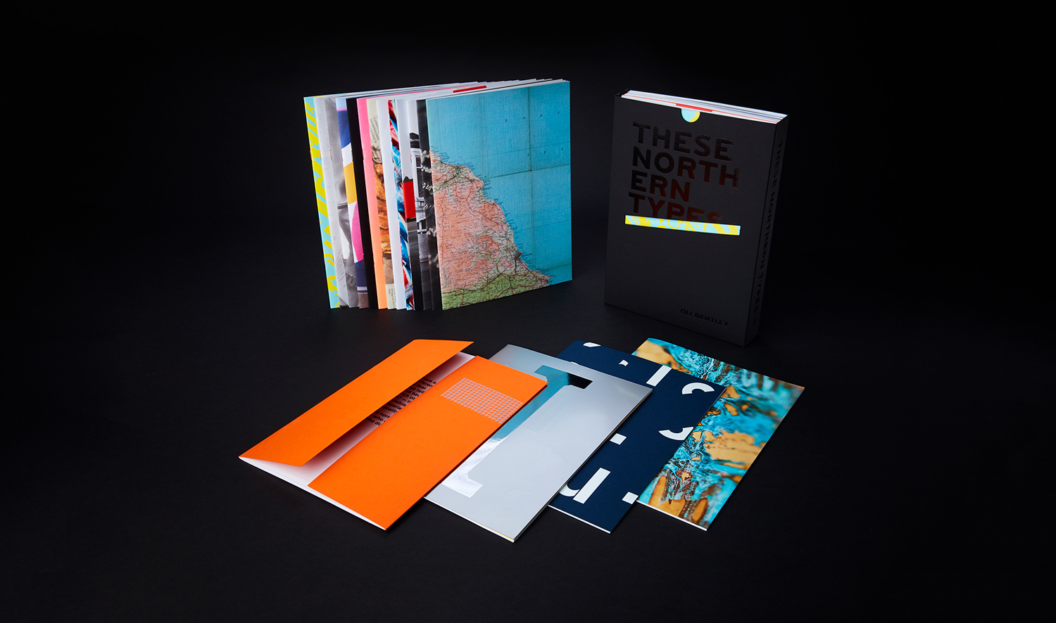
Identitiy is becoming more and more important in a globalised world and Oli attempts to address what it means to be from the north. This project is quite wide reaching and provides a commentary on may socio-ecological aspects. Given the time given, I dont think it would be possible to tackle my own identity in this way.
https://www.itsnicethat.com/features/oli-bentley-these-northern-types-publication-151018
Having said that, a nice offshoot from this project was that of The People Powered Press.
“The People Powered Press, was recognized by Guinness World Records as the world’s largest letterpress printing press, with a print area of 1.363 meters squared on 15 April 2019 and it was part of an exploration of identity through type aka Split’s These Northern Types project -an exploration of contemporary northern”
Oli describes wanting to make something that, “could amplify voices in a community”. It only succeeds if people work together and create messages that mean something to the local people. I admire how the initial project went off on a tangent to create something which speaks volumes, not only locally, but on a global stage too.
https://www.saltsworks.com/people-powered-press/about-the-people-powered-press
John Lewis Collection
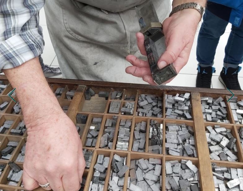
Another printing place I wanted to include in this initial research is that of the Norwich Printing Museum.
“The museum was born from a collection of printing machinery, type and bindery equipment from the early days of Jarrold & Son Ltd which was first established in Suffolk in 1815.”
It currently resides at the Blickling Hall estate and is open to the public from the 31st March 2022. This feels like it may important in my research into place-based typography.
https://www.norwichprintingmuseum.co.uk/
Leave a Reply