
This week we looked at the impact that typorgaphy can have on a location. Stuart Tolley, Course Leader, starts by telling us that, “typography is ubiquitous” – Omnipresent and ever-prsent. They are like clothes for the words which can influence tone of voice and interpretation.
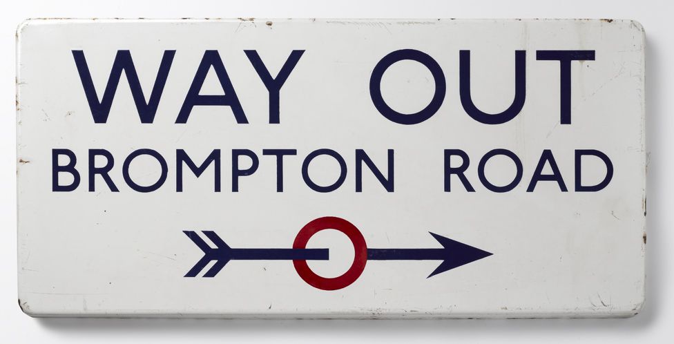
I cannot think of a more iconic location based font than Johston Sans.
Donna Steel, curator of an exhibition on Johston, said, “All the advertising, all the signage was all completely different – there was this cacophony of letters. Johnston applied the proportions of Roman capital letters to his typeface, so it was rooted in history, rooted in traditional calligraphy. But it has an elegance and a simplicity that absolutely fitted the modern age.”
Prvious to the 1916 typeface, typographers were trying to replicate victorian handwriting. With its flourishes and curls it became difficult to read and overcomplicated. Johnston combined accesibility, boldness and simplicity to create a face which filled its viewers with confidence and a sense of authority which would stand the test of time. Its refined lines and striking form made it believable and earned the trust of millions of commuters in a short period of time.
I suppose the biggest thing I take from this is, “it’s the way it has always been done”, doesn’t mean it is the right or best way for it to be done.
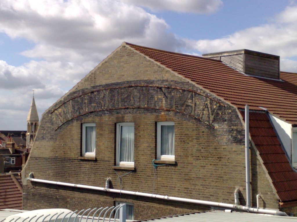
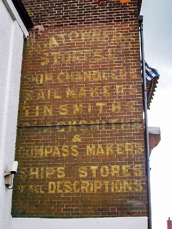
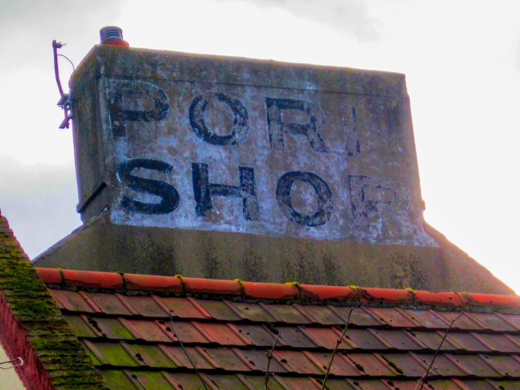
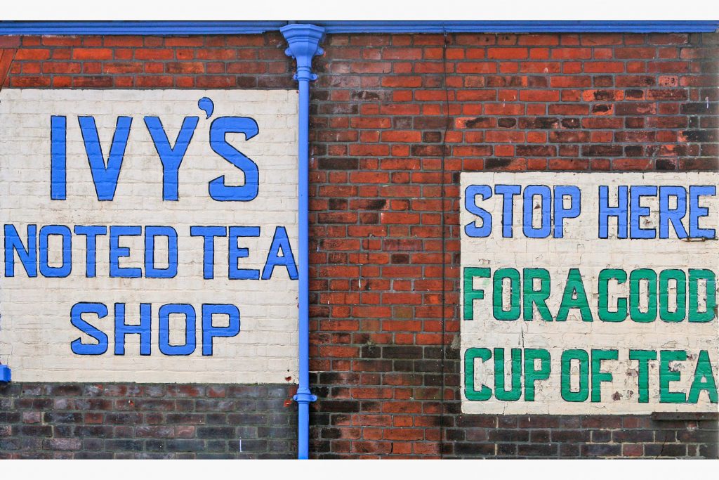
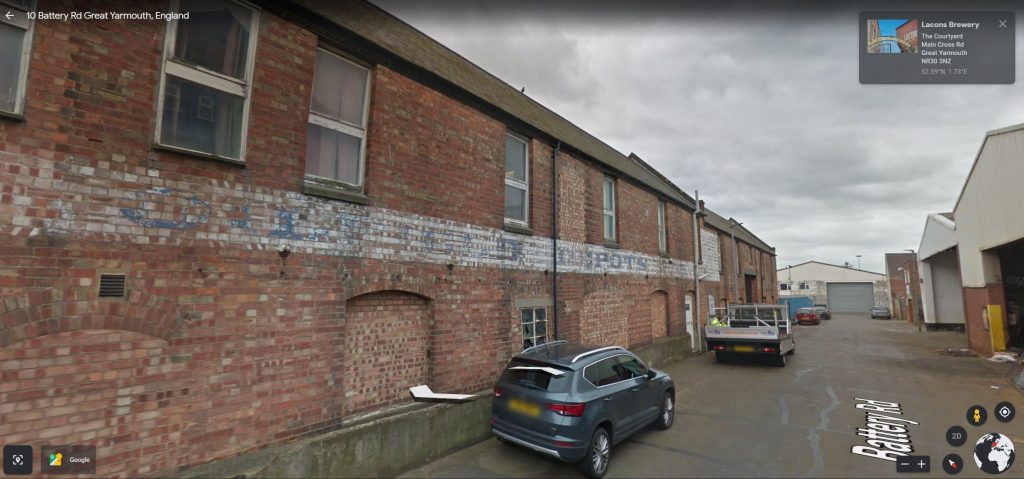
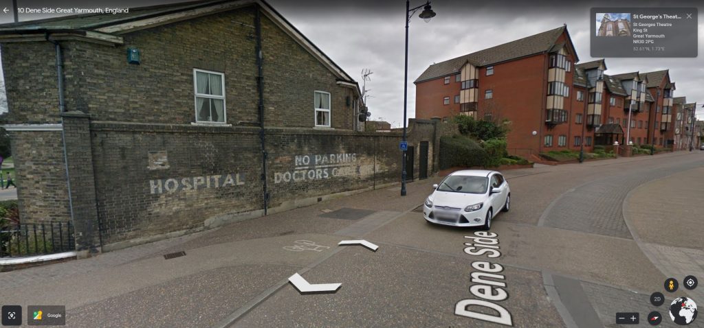
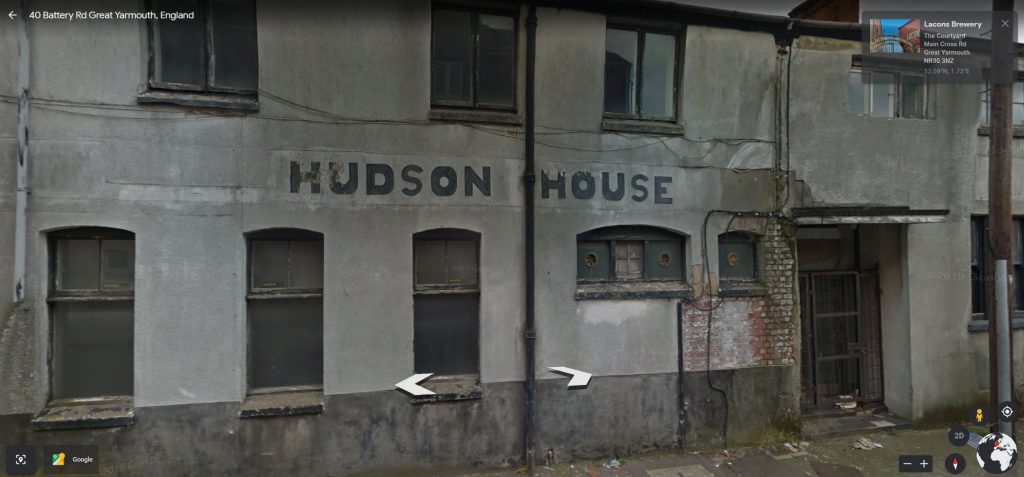
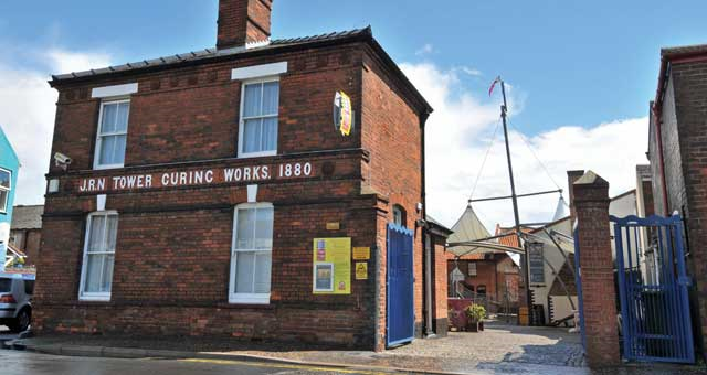
Ghost Signs
I love the history and stories that ghost signs can tell. Below shows some of my research into those that appear in Great Yarmouth.


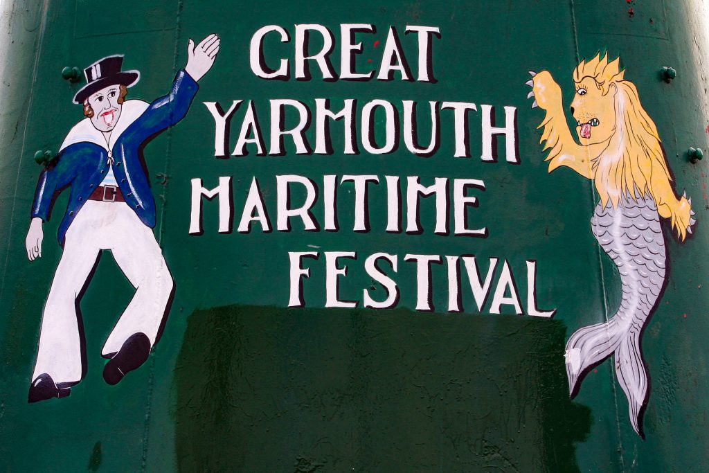
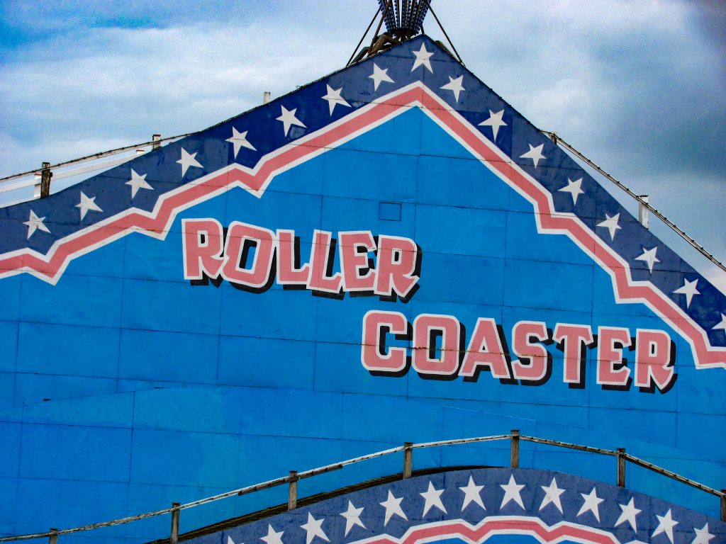
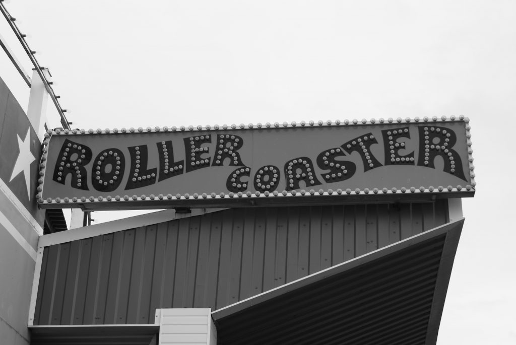
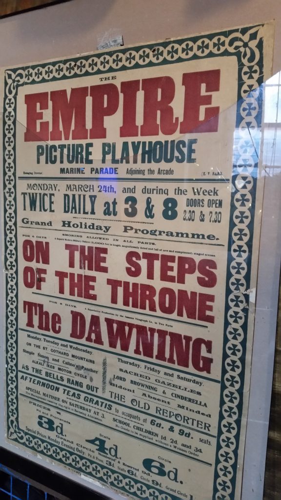
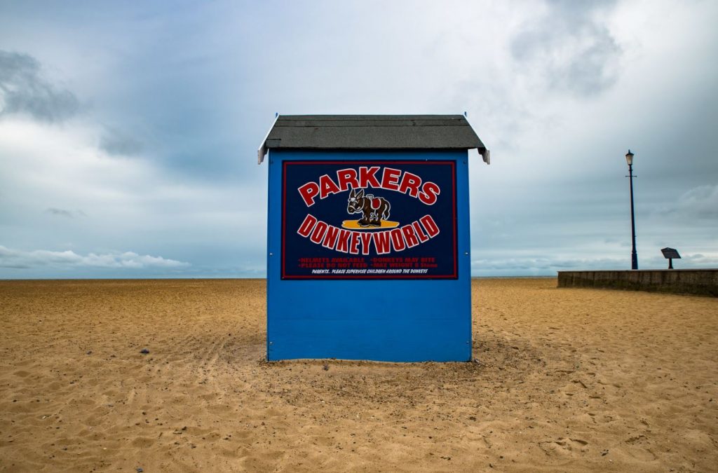
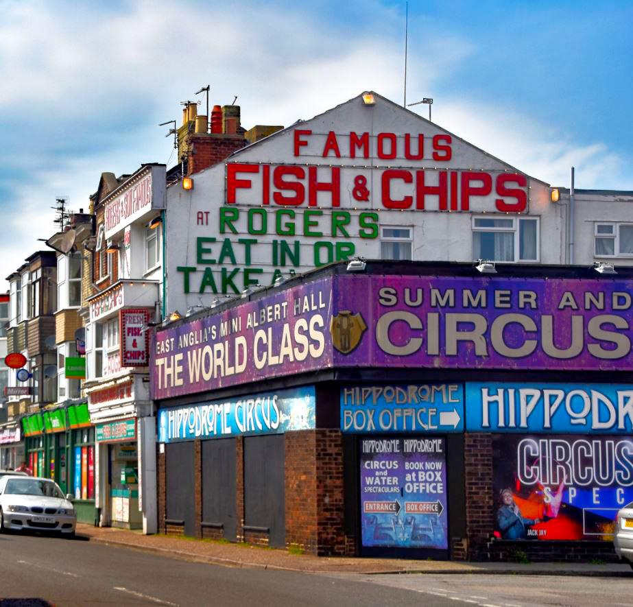
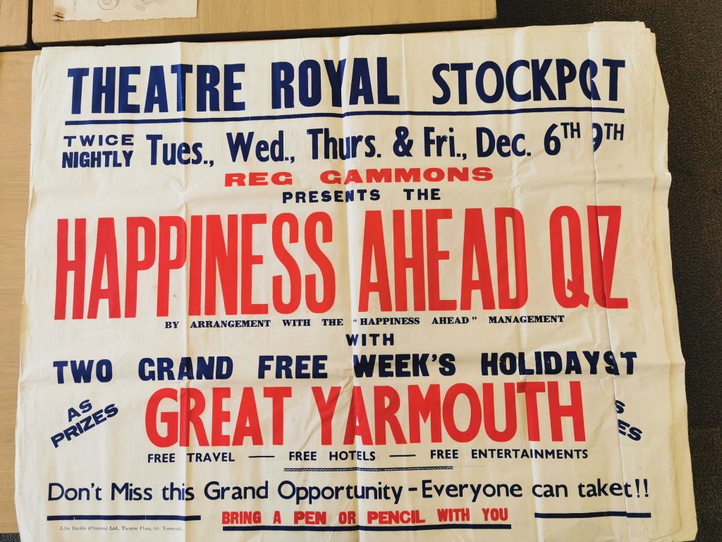
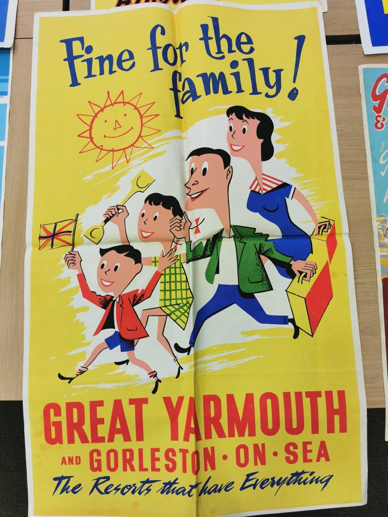
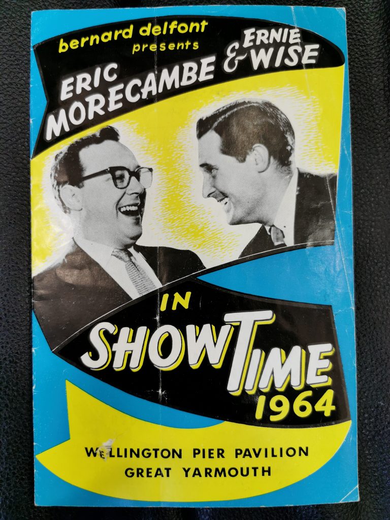
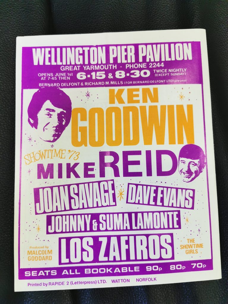
That’s Showbiz
During my research it became apparent that there was a second side to Great Yarmouth’s history. That of holiday and spectacle. The below shows some images which depict those ideas.


Follow the Sign[writer]s
“In England, lettering on signs did not become commonplace until the 18th century, as literacy rates increased. This coincided with England becoming a major centre of lettering excellence, with advances in typography from William Caslon and John Baskerville, and the innovative English Round Hand calligraphy popularised by George Bickham and Charles Snell.” Richard Gregory
I believe there is a strong link between the work of signwriters and graphic designers today. Signwriting used to be considered a trade and was taught as part of building courses in the UK. Then, as the builders finished their buildings they could offer a further service in signwriting.
As the profession developed and the importance of brand was recognised people were able to make an income from signwriting alone. If you wanted to ensure your brand was consistently painted across all of your properties you would employ the same signwriter.
Each building type, service and offer started to become associated with certain types of forms and lettering. Holiday destinations began to use fun, bright and exciting typography to entice visitors and locals into their establishments.
I think Great Yarmouth shows a bit of both these styles – the simple bold fonts of business ghost signs as well as the vibrant, colourful signs of the amusements and funfairs.
Workshop Challenge
Step 1: Explore and Collect
My initial response to this challenge was to ask the community for help and boy did they deliver. Below is my post which shows the engagement and reactions:
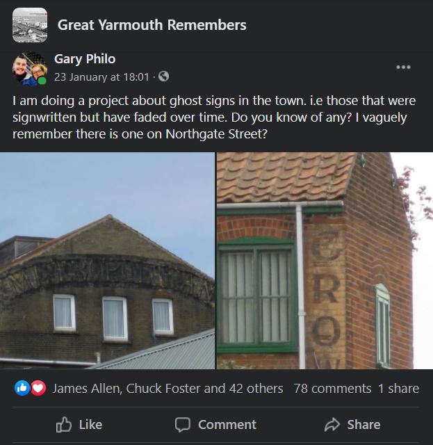
This research gave me an excellent starting point for finding more images which help to identify my location.


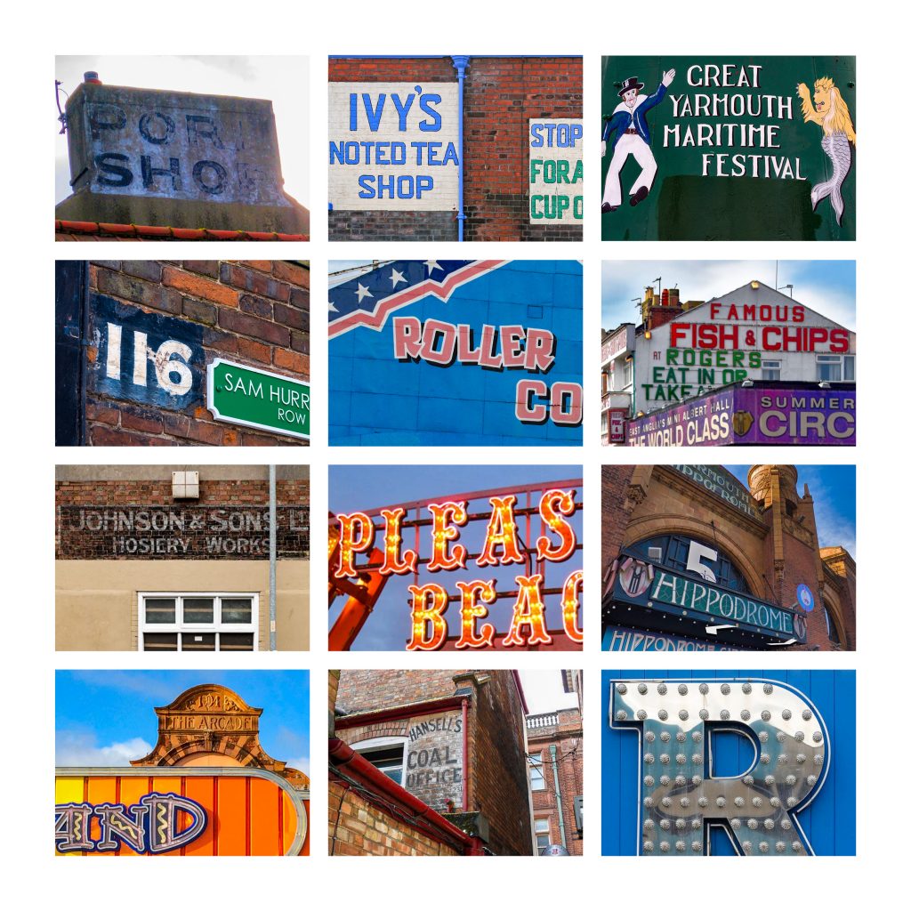
The Top 12
With my top 12, I tried to select images which showed various aspects to life and history in Great Yarmouth. It is a place with a rich, fishing resort history alongside that of a holiday destination for many families each year.
Ideas Wall


Step 2: Analyse

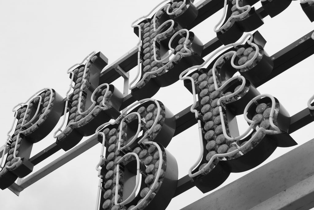
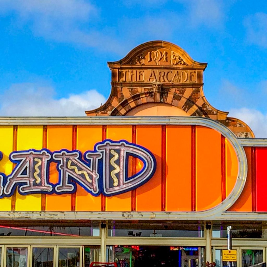
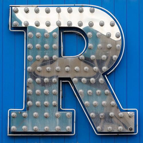
The Silver Slipper
The glistening silver ‘R’ reflects the sun to holiday makers as they pass by promenading. Made from metal, glass and neon tubing, it is not until dusk has fallen that this letter form really shines. The intricate glass bulbs which illuminate at night give a subtle nod to the history behind arcade lighting and facades. The form of the letter itself is bold and stands out for readability. No need to over embellish a shape which will be unavoidably in your face when darkness comes. It reminds me of nostalgia and excitement working perfectly to entice you in.
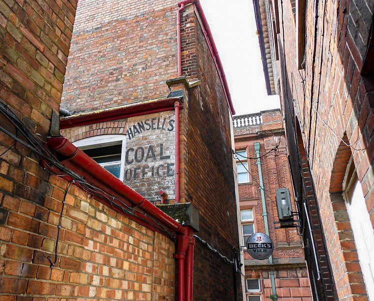
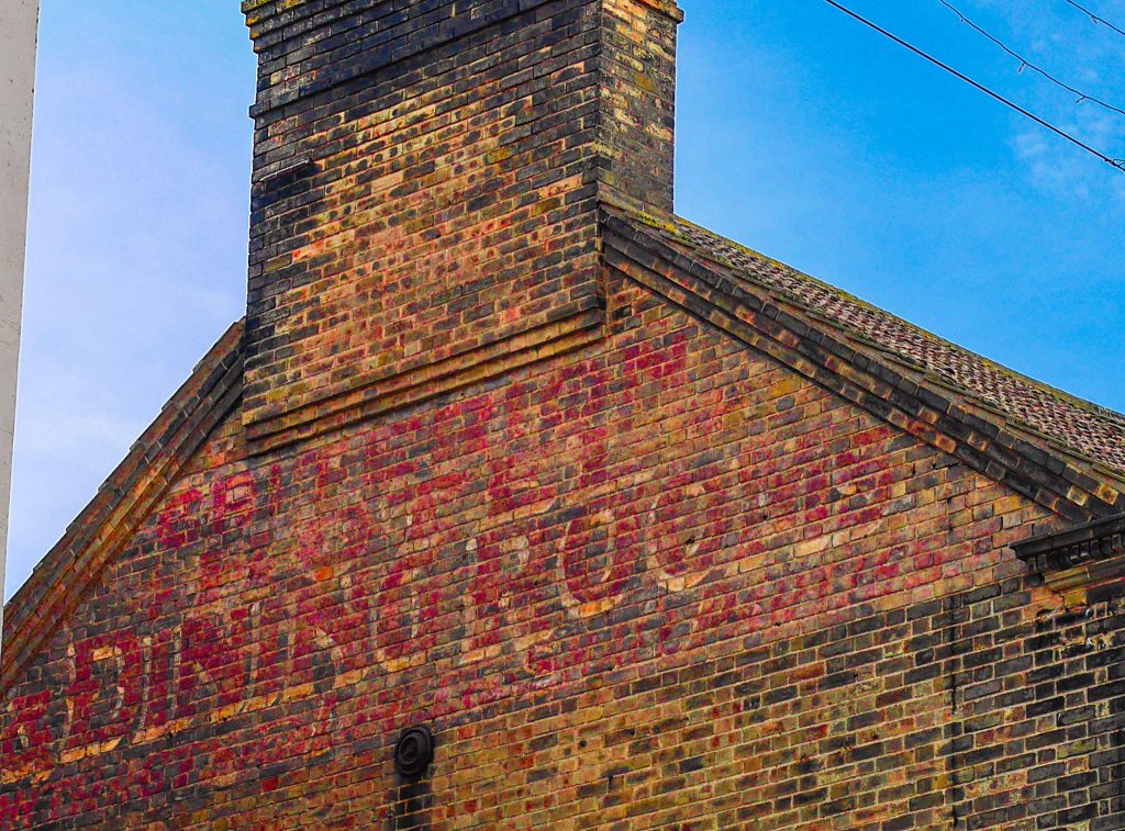
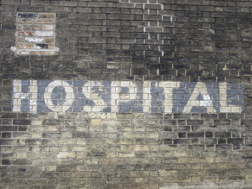
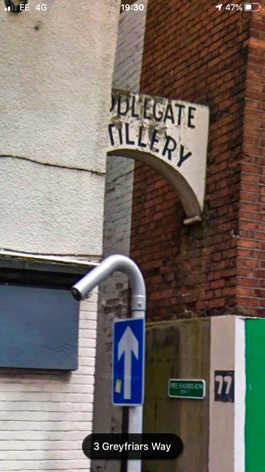
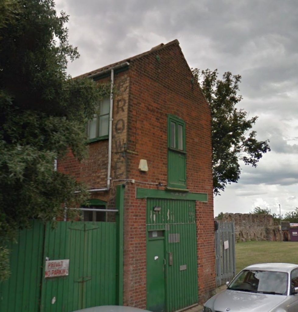
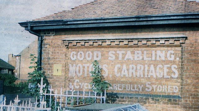
A Sign of a Ghost
I struggled to find any reference to Hansell’s Coal Merchants but their sign still adorns the side of a building which is nestled down one of the historic Rows. A sought after commodity in the later 19th early 20th century, the ‘Coal Office’ was located in the middle of the poorest neighbourhoods with good links to the port. The letter forms are simple, and hand painted. I wonder how the number 231 relates to the sign – if at all? The slight curvature of the name suggests an acknowledgement of brand and may have been used on vehicles or other buildings.
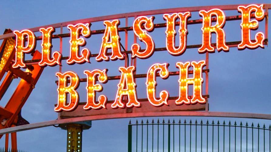
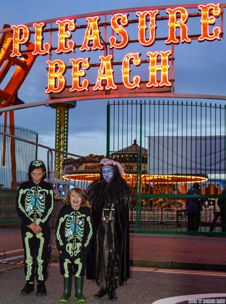
Always a Pleasure
This sign is clear and modern, making use of technology and lighting to stand out with bold fresh colours. The red and orange mimic the summer season and remind the viewer of the fun that can be had. The forms this time, relate to a historical reference of funfair signage where the top, bottom and middle of each character have a flourish. The kerning of the words is elongated to give them prominence and grandeur when viewed by an excited visitor.

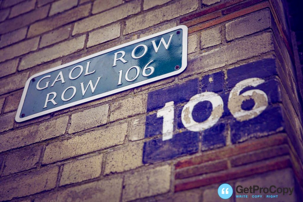
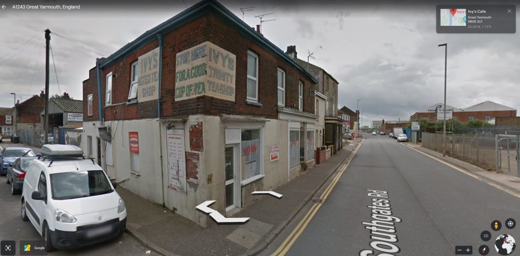
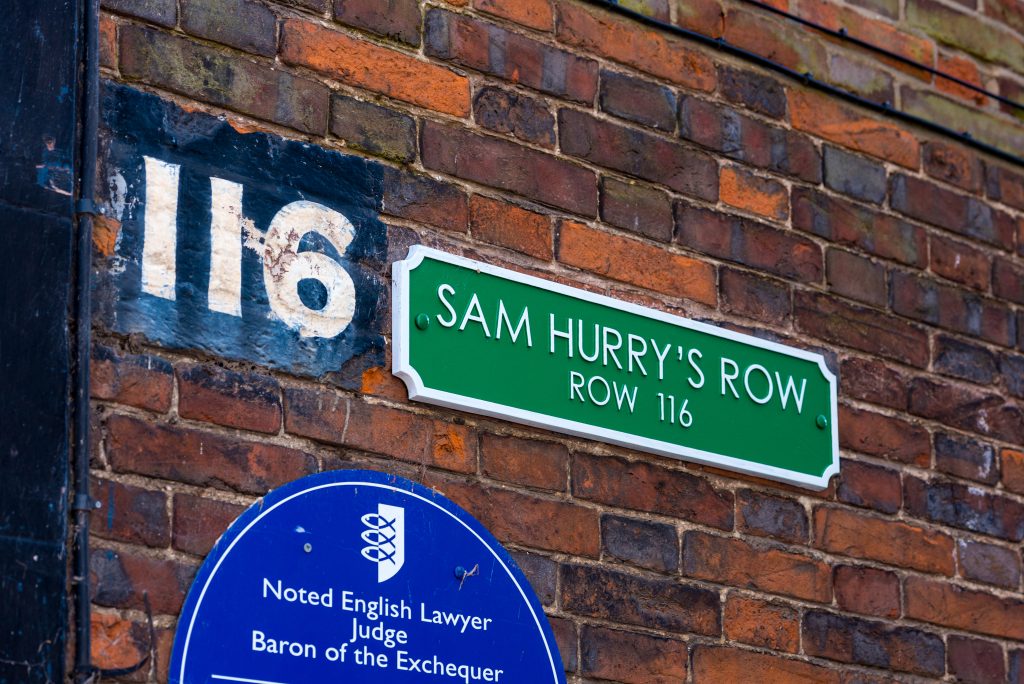
Find Your Own Way
The painted black box with the white numbers on top shows the history of the row. It was hand painted, probably by the builder, as a way for people to navigate the labyrinth of passageways that lead from port to town. The newly affixed signage sits next to the row number, so it does not obscure it, but instead, enhances its history and importance to the town. A lot to take in, this group of signs also displays a blue plaque – signifying someone of importance lived here. Fading now, I hope these original wayfinding signs continue to stand the test of time.

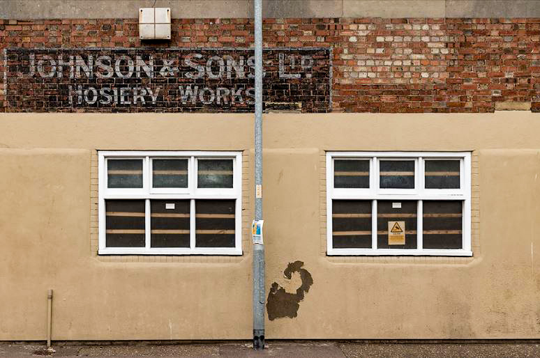
Did Hosiery Work?
Established in 1801, Johnson & Sons made oilskin clothing for fisherman and merchant seaman. By the beginning of the 20th century they exported clothing all over the world. They even had three factories in Great Yarmouth alone. Their name was their brand and respected it was. A place for families to work and buy their products. The signage would have been branded on the side of all of their buildings and been identical. Simple in form with and eye-catching ampersands and ‘ltd’ embellishments. Black and white was traditional due to its boldness, cheapness and availability.
Personal Reflection
When it comes to Great Yarmouth, there are two clear divides in typography which appraise the historical context of the location.
There is the fun, whimsical typefaces which have developed over many years to signify to the viewer the enjoyment that can be had by stepping inside.
There are also ghost signs which have were rendered on the outside of buildings to indicate what services were on offer inside.
With the development of literacy and brand, signwriting became a profession in its own right. This afforded businesses and the signwriters themselves the opportunity to experiment with typography and form to denote feeling, tone of voice and style.
To me, there is a clear pathway from the signwriters who were taught as labourers in a school to those creating funfair graphics and branded elements on the side of buildings to the Graphic Designers we are today.
Great Yarmouth highlights this process and is proud of its heritage, culture and tourism. Something I hope to explore further going forward.
References
https://www.signpainting.co.uk/craft/
https://www.edp24.co.uk/news/did-you-work-at-johnson-sons-in-great-yarmouth-historian-524190
Blackwell, Lewis (2000) ‘Edward Fella: Letters on America (Links to an external site.)’, Princeton Architectural Press
Baines, Phil (2003) Signs, Lettering and Environment (Links to an external site.), (London: Laurence King)
Bentley, Alexander and O’Brian, Michael J. (2017) ‘Chapter 2: Change is not Norman’) in The Acceleration of Cultural Change (Links to an external site.), (Cambridge, Mass: MIT Press)
Hustwit, Gary (2015) ‘A Rare Interview with Graphic Design Legend Massimo Vignelli (Links to an external site.)’, Fast Company, 24 March [online]. (Accessed: 5th December 2018)
mikedempsey.typepad.com. 2021. Graphic Journey Blog. [online] Available at: https://mikedempsey.typepad.com/graphic_journey_blog/design/ [Accessed 1 May 2021].
Sign School., 2021. Traditional Signwriting. [online] Youtube.com. Available at: https://www.youtube.com/watch?v=763en_I5HqU [Accessed 1 May 2021].
Greatyarmouthlocalhistoryandarchaeology.com. 2021. Historic Great Yarmouth. [online] Available at: https://www.greatyarmouthlocalhistoryandarchaeology.com/old-great-yarmouth [Accessed 1 May 2021].
Leave a Reply