By the end of this week, you should be able to:
- Research into typographic design broadly.
- Analyse how typographic conventions and design can inform and imbue the meaning of a given text?
- Imagine how written text can be translated and communicated into a new typographic form.
- Create and analyse your typeset piece.
- Document and communicate your working process on your blog.
- Participate in and reflect upon debate on the ideas wall.
- Manage your independent learning through good planning and self direction.
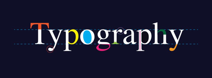
A Brief History of Type
This week’s lecture, taken by Kristoffer Soelling (Regular Practice), started by covering the history of ‘Print and Press’.
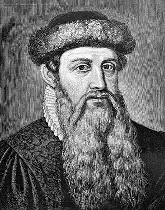
Johannes Guttenberg was one of the first to help with the mass production of books and type. Before him, everything was handwritten which would lead to inconsistencies and take an awfully long time. Guttenberg created a copy of the bible in the 1400s with the help of his invention, the printing press.
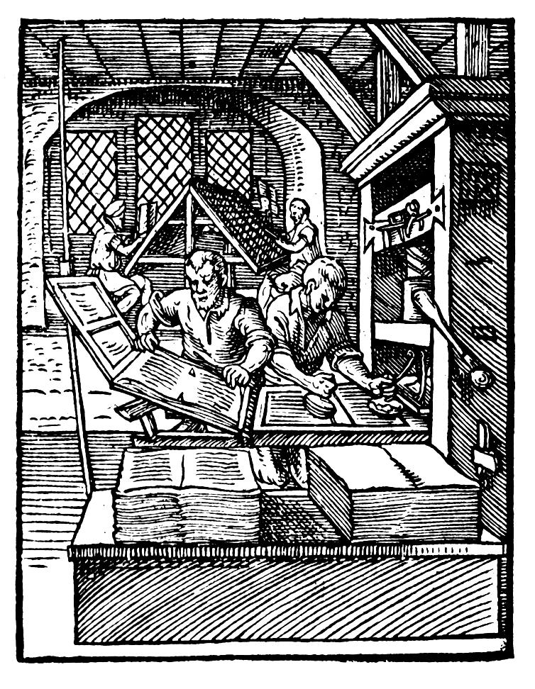
This was the first step towards mass production and standardisation within the printed world. Without this major step forward Graphic Design, as it is today, would not exist.
When the Linotype was introduced to the world in 1886 it was known as, “The 8th wonder of the world.” It had the capability to produce a line of text at one time and vastly increased the speed of printing. It stayed this way for over a decade and became the industry standard.
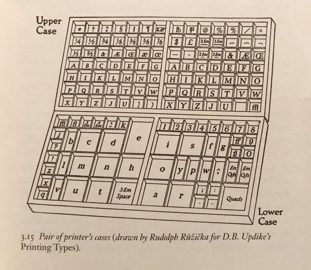
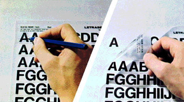
Using type in this way was, however, reserved for the wealthiest in society. It wasn’t until the 1950s and the founding of the Letraset business, that standardise type was put into the hands of the public.
At roughly the same time photography was being used more and more. The use of of photography was applied to the world of print through phototypsetting machines. The video below explains the process.
What was brilliant about this way of working was that whole font sets could now be created on one single disk. This saved a lot of space compared with the old printer trays full of individual letters. In addition to this, the use of light meant the characters could be scaled from 4pt to 36pt and the operators did not risk getting poisoned from any fumes!
As with most things, speed is king. This is as true within the world of print and, although it was created in 1875, offset printing didn’t really start to come into its own until the 20th century. It is the process which most modern mass printers use today. It provides a consistent, high quality image, fast which saves on time and money. The process can be seen below:
Just Not My Type
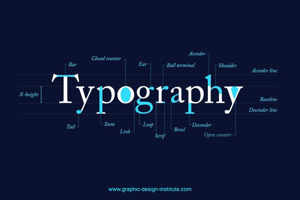
The above shows how modern typography is formed and the names for the possible aspects of each font. By varying some of these elements a world of creative fonts has been created. The below document highlights some of the most popular styles which have emerged in various forms of print.
https://www.bbc.co.uk/news/magazine-35916807
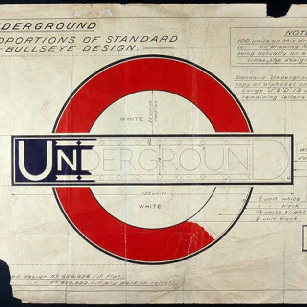
One of my favourite fonts is Johnston. It reminds me of the same process of Margaret Calvert’s street signs. It was created to fulfill an purpose. It had to be easy to read, crisp and clean. The words ‘Graphic Designer’ and ‘typographer’ were not used in the 1910s, but Edward Johnston was definitely one of the first. In fact, I believe that people like Mr Johnston were the forefathers of Graphic Design.
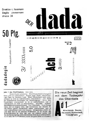
Shortly after the unveiling of the Undergrounds new typeface, the Dada period followed. These graphical artists began using type in a different, exciting way. In Soelling’s own words, ” [a] liberation of type”.
Contradictory to this idea from the Dadaists was Beatrice Warde’s theories in her “Crystal Goblet”. She argues that type should be invisible and is just a tool to convey the thoughts and meaning of the writer. I get that, I really do. Type can be used to be a mode of transport for ideas. There are fonts dedicated to ‘being invisible’ – Arial for example. That’s fine. But then there are cases when typography enhances the message and make it stand out. This piece by Paula Scher:
As a Graphic Designer, I know what use of type I prefer! A paint brush is a tool which can be used to paint a room. It can also be used to paint the Mona Lisa. What would you rather look at?
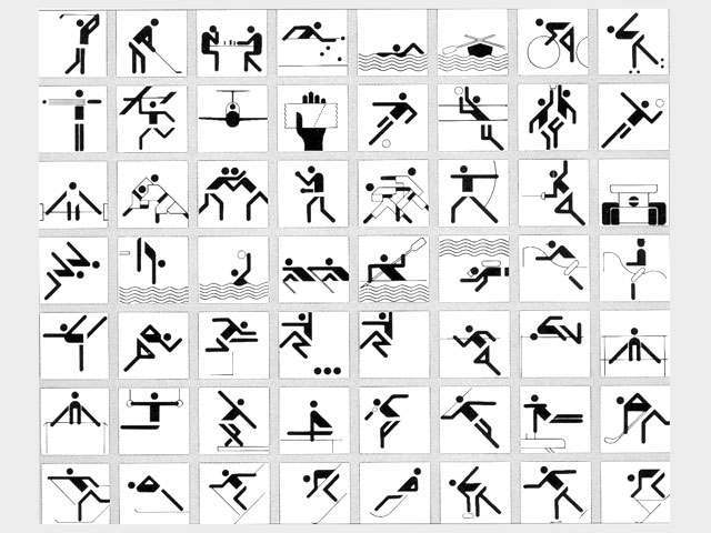
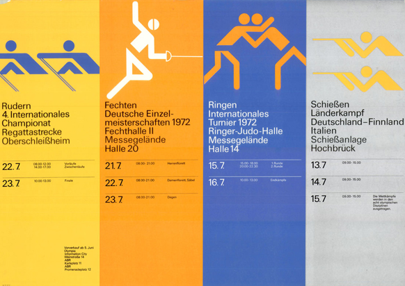
Following the exciting, forward thinking ideas of the Bauhaus, staff members began to leave Germany and spread these ideas. Otl Aicher, used the ideas of a system or grid to tackle some of the biggest design briefs. In 1972, he made a staggering 180 pictograms using this design process to ensure consistency and aesthetics. The relationship between text and image / illustration really came into its own during this period.
Years had been spent identifying and creating an aesthetic, when it came to type, and now a journey had started to find how image correlated to that aesthetic.
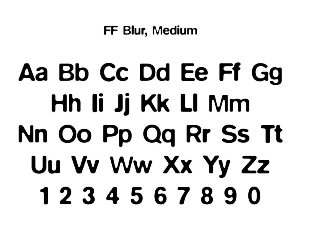
The digital revolution and the introduction of the Macintosh computer in the mid-1980s made the construction and deconstruction of typographical elements easier than it had been in the past. Embracing technology that was growing exponentially more sophisticated, designers realized more and more complex typographic experiment. Neville Brody’s FF Blur is one example. Influenced by the late-1970s punk rock aesthetic, Brody began his career at the London College of Printing and later designed record covers for various artists while art director of Fetish Records. The letterforms of FF Blur—fuzzy around the edges like an out-of-focus photograph—seem to celebrate their own imperfection, speaking to his unique background. FF Blur resembles type that has been reproduced cheaply on a Xerox machine—degenerated through copying and recopying. (https://www.moma.org/collection/works/139325)
Of course, the experimenting with type and font is a continual process. Neville Brody created the above typeface to accompany image and be suggestive of the digital age that we were moving into.
“graphic design and type is a story of technological advancements” Kristoffer Soelling, Regular Practice
Technology is constantly developing and providing new areas for designers to explore and apply to typography and design. As Ophelia from Pearlfisher said in this week’s lecture, it’s more about the future rather than trends. Trends makes it seem like it is fleeting but some things, the important things, will be around for years to come.
Ideas Wall
Workshop Challenge
Take an excerpt from a national poet or writer and translate into a new typographic form;
- Take the first line – draw it, typeset it, build it;
- Then take the body of the text and typeset it.
- How does leading, positioning, stresses on particular words and detailing affect the power of the piece?
- How is meaning affected by interpretation in a tangible way?
- What is the relationship of the page?
Upload to the ideas wall your thoughts, and a link to your blog demonstrating further reflection
Once upon a midnight dreary, while I pondered, weak and weary,
Over many a quaint and curious volume of forgotten lore—
While I nodded, nearly napping, suddenly there came a tapping,
As of some one gently rapping, rapping at my chamber door.
“’Tis some visitor,” I muttered, “tapping at my chamber door—
Only this and nothing more.”
And the Raven, never flitting, still is sitting, still is sitting
On the pallid bust of Pallas just above my chamber door;
And his eyes have all the seeming of a demon’s that is dreaming,
And the lamp-light o’er him streaming throws his shadow on the floor;
And my soul from out that shadow that lies floating on the floor
Shall be lifted—nevermore
Final Piece
Personal Reflection
Although a quick introduction into typography and its history, I feel that I have learnt a lot from this week’s lecture and have filled in some important gaps in my knowledge.
A better grasp of the history of a subject provides a more rounded understanding of its creation, limitations and uses. By employing this comprehension we are able to predict the future and use an informed approach to design.
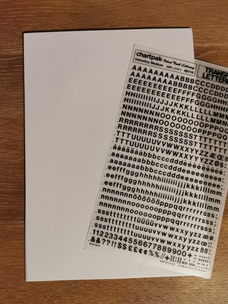
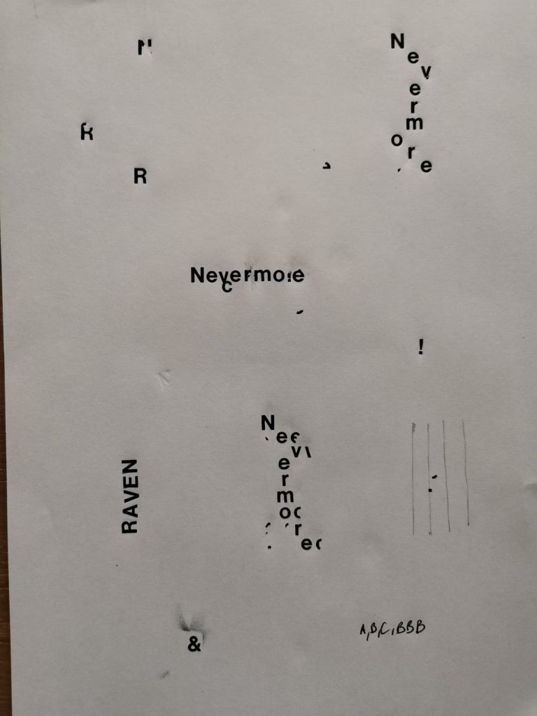
I really wanted to get away from the screen this week as so much of typography’s history is rooted in physical endeavours. I started this week’s challenge by purchasing a dry transfer sheet and applying it to a sheet of A4 paper. It took some getting used to, however, I really liked the effect it gave when parts of the neighbouring letter would imprint onto the page.
I chose this method of creating because, while it did not take as long as some historical methods, it provided me with an understanding of the difficulties that have been faced. The space between the letters, making sure they were on the same level and that each one was crisp and clean would have still been time consuming when first introduced.
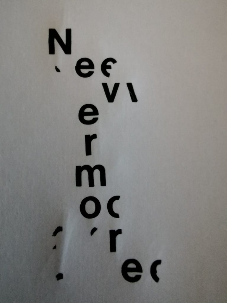
I laid the word ‘Nevermore’ out in the rhyming pattern of the poem as I liked the rhythm that poems create. I hope that in doing this I can emphasise the pattern.
On the ideas wall I wrote:
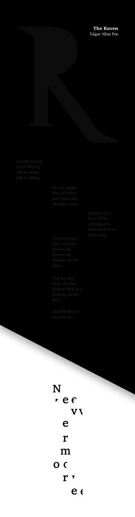
I used the iambic pentameter to align each line of the text and have made it 98% black on a black background. If this were printed I would also have it spot UV varnished so the text would shine.
The lower section of the piece represents the duality of life and the choices we make – Do we sink into a dark depression or do we fight back and head for the light.
In the case of the protagonist in The Raven, his depression (The Raven) is forever watching him. That is why the black dominates the piece.
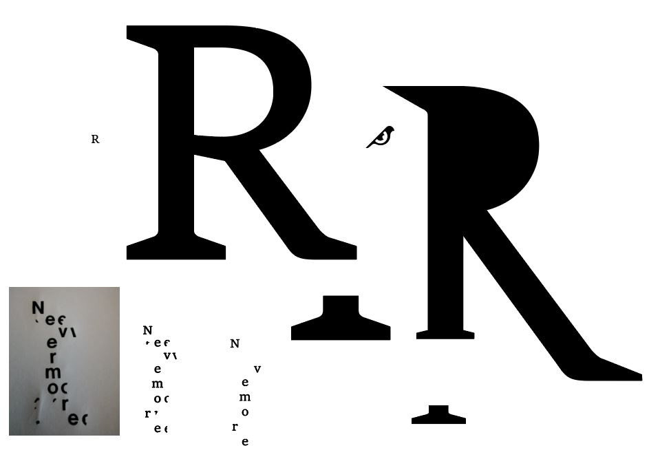
I also played with the form of the ‘R’ to make it resemble the shape of the Raven. It is pictured on top of the final piece to mirror the line which says,
“And the Raven, never flitting, still is sitting, still is sitting On the pallid bust of Pallas just above my chamber door;”
Overall I think the text at the bottom is the real winner this week. by using an older technique I have come up with a way to use typography to enhance a design. The eroding neighbouring letters links with the ideas of the poems in that, we sometimes make half decisions and our brains rarely operate in a linear way.
Often, I feel we forget how we are blessed to be part of this digital age. A couple of taps of a keyboard and mouse and I can create something that my design ancestors could not even dream of. I wonder if they felt the same when they were creating? I wonder if the methods we use today will be seen as archaic to a new generation in the future?
References
Kubel, H. and Williams, S.,(2015) Type: New Perspectives in Typography (Links to an external site.). London: Laurence King.
Baines, P. and Haslam, A., (2005) Type & Typography (Links to an external site.). London: Laurence King.
Johannes Guttenberg. Image. Available at – https://en.wikipedia.org/wiki/Johannes_Gutenberg [Accessed 20/01/21]
Hullabaloo. Website. ‘Whatever happened to Letraset?’. Available at: https://hullabaloo.co.uk/blog/whatever-happened-letraset/ [Accessed 20/01/21]
Anatomy of Typography. Website. Available at: https://www.graphic-design-institute.com/visual-grammar/anatomy-typography-designers/ [Accessed 20/01/21]
Johnston Sans: The Tube typeface that changed everything. Dan Damon. BBC Website. Available at: https://www.bbc.co.uk/news/magazine-35916807 [Accessed 20/01/21]
Dada Typography. Website. Available at: http://designseminar-1.blogspot.com/p/typography.html#:~:text=Typography%20during%20the%20Dada%20time,the%20way%20type%20was%20used.&text=Raoul%20Hausmann,%20cover%20of%20the%20first%20periodical%20Der%20Dada,%201919. [Accessed 20/01/21]
This is what 500 years of graphic design in print looks like. Rian Dundon. Timeline Website. Available at: https://timeline.com/this-is-what-500-years-of-graphic-design-in-print-looks-like-53d413e56987 [Accessed 20/01/21]
Quick Design History: Otl Aicher. Jen Dennis. Shilligton Website. Available at: https://www.shillingtoneducation.com/blog/otl-aicher-tbt/ [Accessed 20/01/21]
Leave a Reply