“The single biggest problem in communication is the illusion that it has taken place.” George Bernard Shaw
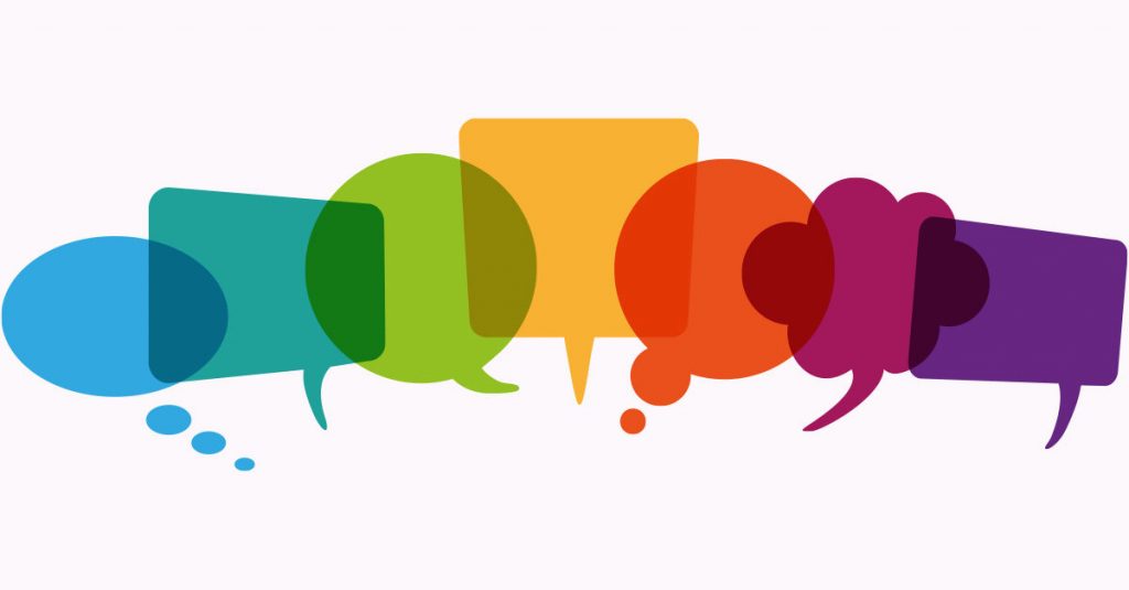
Communication is not a given
In this weeks lecture, by Martin Hosken, he discusses the idea that communication can fail. By that, he means that the message is not received in the intended way. I honestly hadn’t really thought about this. Most of my work happens in a local bubble where meaning and understanding is relatively universal. Of course, when a subject crosses boundaries in terms of language and culture this intended message may mean something completely different.
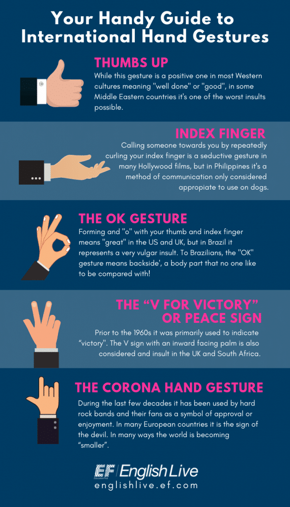
The simplest way to show this is with a simple thumbs up. As per below, “In western cultures it means ‘well done’ or ‘good’ while in some Middle Eastern countries it’s one of the worst insults possible”
“…useful to think of words as simply a collection of characters with corresponding sounds that have evolved to make communication of intentions to evoke the image.” Martin Hosken
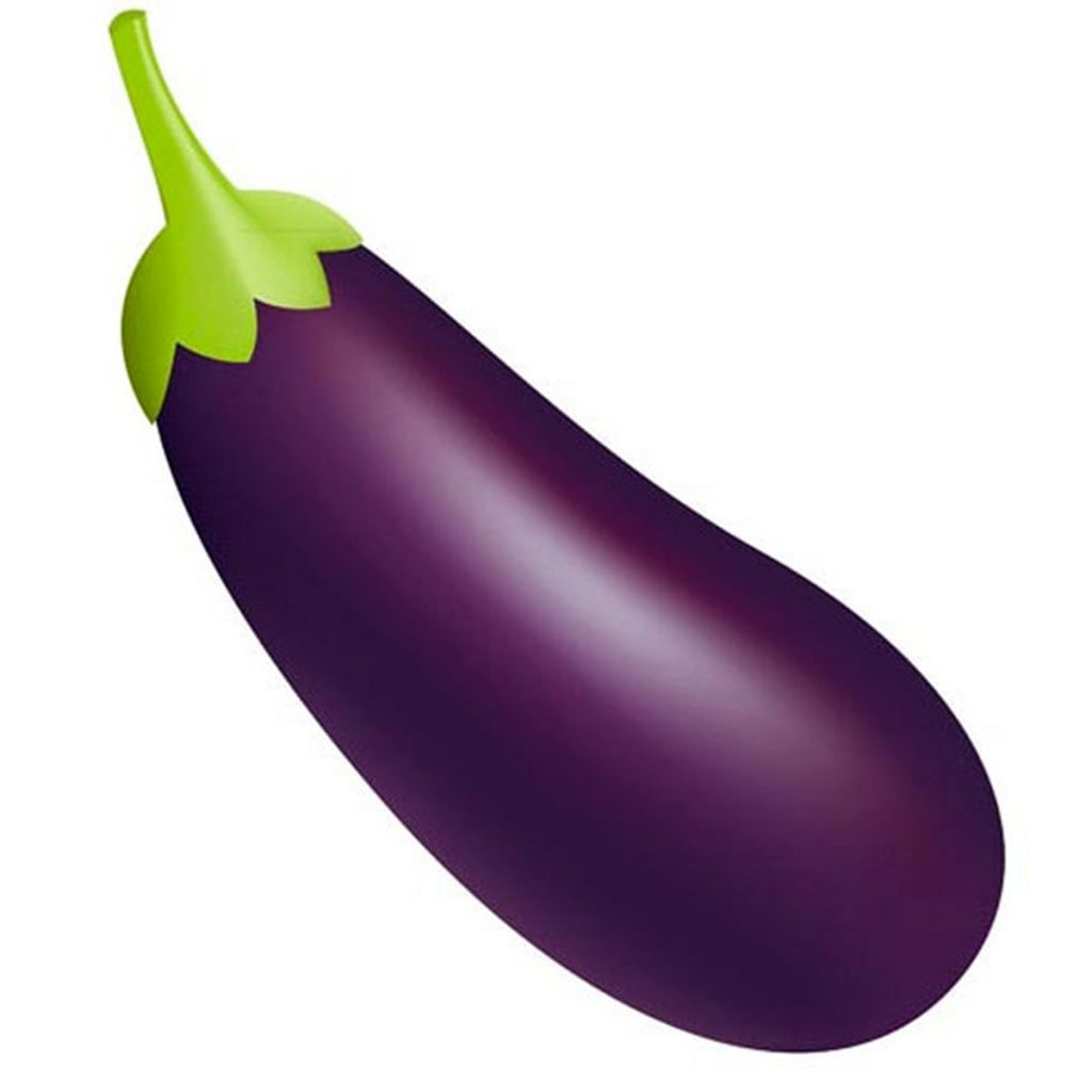
The above statement reduces communication to its simplest form. However, there are many factors which change their meaning, and it is the writer who has the true power in determining their intention. You have heard the saying, “The pen is mightier than the sword”, right? To bring this into the 21st century I considered the use of emojis and how their meaning can change depending on context and culture. The below is an emoji of an eggplant. It can be used to represent an eggplant or aubergine, but it is most commonly used to represent a penis. How on earth did that happen and was it the intention of the designer?
So there are 4 things which influence how communication comes to take place. These are:
- The sender – who creates the messages
- The intention – the message itself
- The transmission – the means by which it’s sent; any noise or interruption the message must pass through before it is finally received
- The recipient; with a further stage of the implication for the receiver of its receipt
Semiotics and Symbols
Firstly, lets look at Signs – where the signifier and the signified interact to convey a message. Semiotics proposes that, “anything that conveys a direct meaning is called a sign”.
“ If we think of the red light in a set of traffic lights: the signifier is the red light itself. This is the thing that is used to convey the meaning. Meanwhile the meaning is the signified. In this case it is the concept that you cannot continue to drive your car any further. The sign is therefore the combined element of what the light stands for i.e. the signified, you must stop your car as it is dangerous to continue, and the signifier, the red light.” Martin Hosken
Signs can be ordered into three further categories, icon, index and symbol. As you can see from the above, an icon has some resemblance to an object. The index, implies some character or emotion. In this case death, danger….pirates? “The symbol has no resemblance between the signifier and the original signified”. If you think of the number ‘3’, there is nothing inherent which indicates it represents three of something.
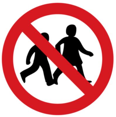
Example 1:
The Signifier: the icon of the children with the red crossing line and red circle
The Signified: the concept – no children allowed.
The Sign: Both these elements combine to make the sign.
Anchorage: Sometimes this sign is seen with additional text “no children” which gives further guidance to the meaning.
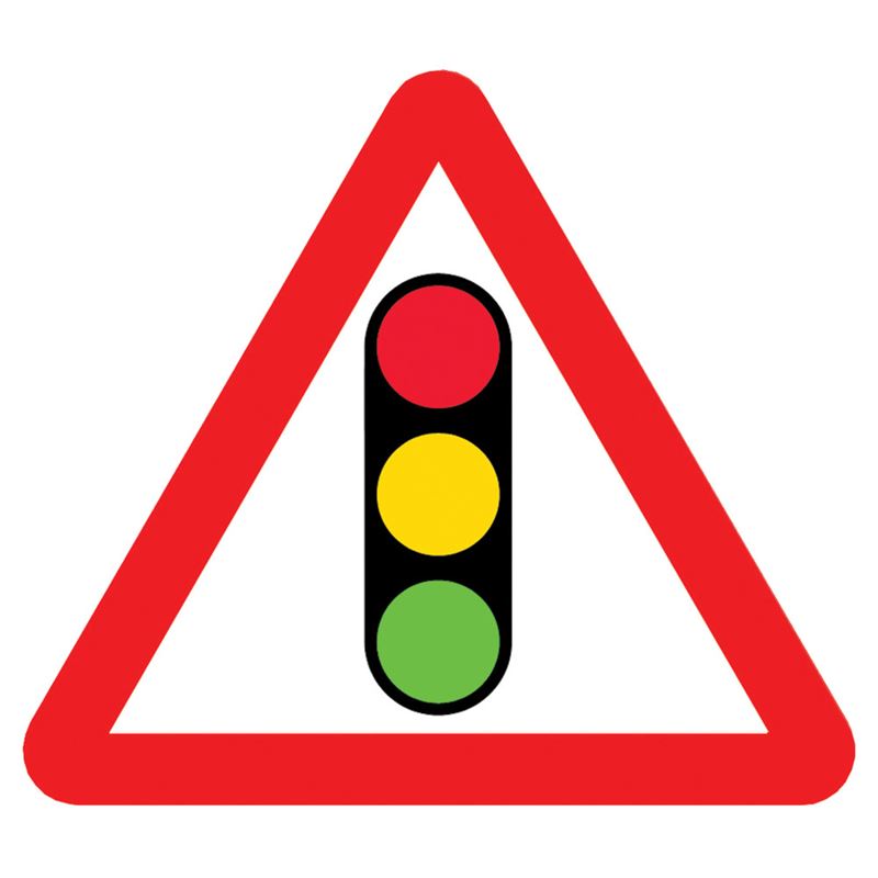
Example 2:
In this case, the meaning is unknown. We know it is something to do with traffic lights from the icon, but no more. The make up of both the icon and symbol of the red triangle makes this a symbolic sign. The only way you will know its intention is by learning its meaning through the highway code. This very visual form of communication allows those with the knowledge of this code to comprehend its meaning quickly when passing in a moving vehicle.
Assonance / Repetition / Relay
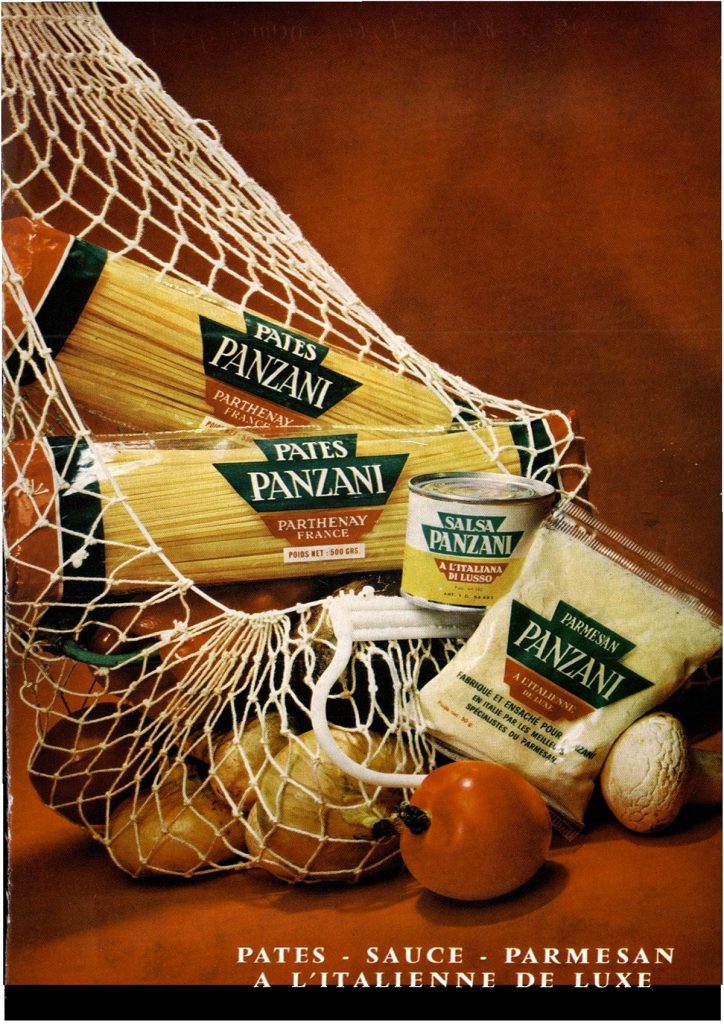
Many adverts employ the concept of relay. Put simply, relay means that the words and the pictures tell a story equally. In the example above there are many things which hint at a signified of ‘italianicity’.
The colours of the Italian flag / home cooking / freshness / the language / Italian art and still life composition / raw and packaged products
In doing this, the advertisers use many tools to convey a signified of Italian lifestyle. One they believe will sell their product.
Once a set of rules or codes has been in place for many years it will often be copied to increase sales. Remember, a guaranteed conveyance of meaning is the goal with brand identification.
This website shows some of the similar brands in the UK: HERE
Symbols and Moving Identities
Variables remain the same
Global context that shifts
Multiple variables that designers lend
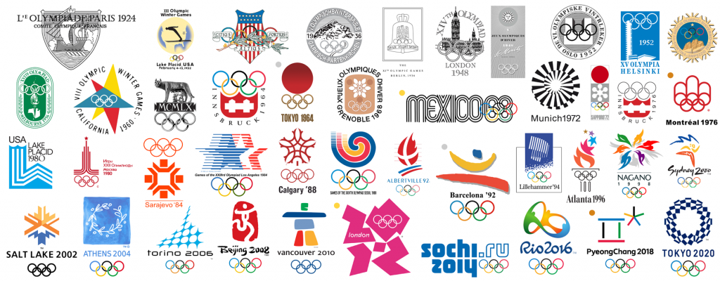
The five rings of the Olympics is known across the globe as a symbol of athleticism, determination and pride. Since the 1920s the host countries have altered the brand to encompass elements pertinent to their own country. Some have gone down in history as graphic design gold, while others have missed the mark. Below is a breakdown of how they have used symbols and semiotics to indicate a national feeling:
System Approach
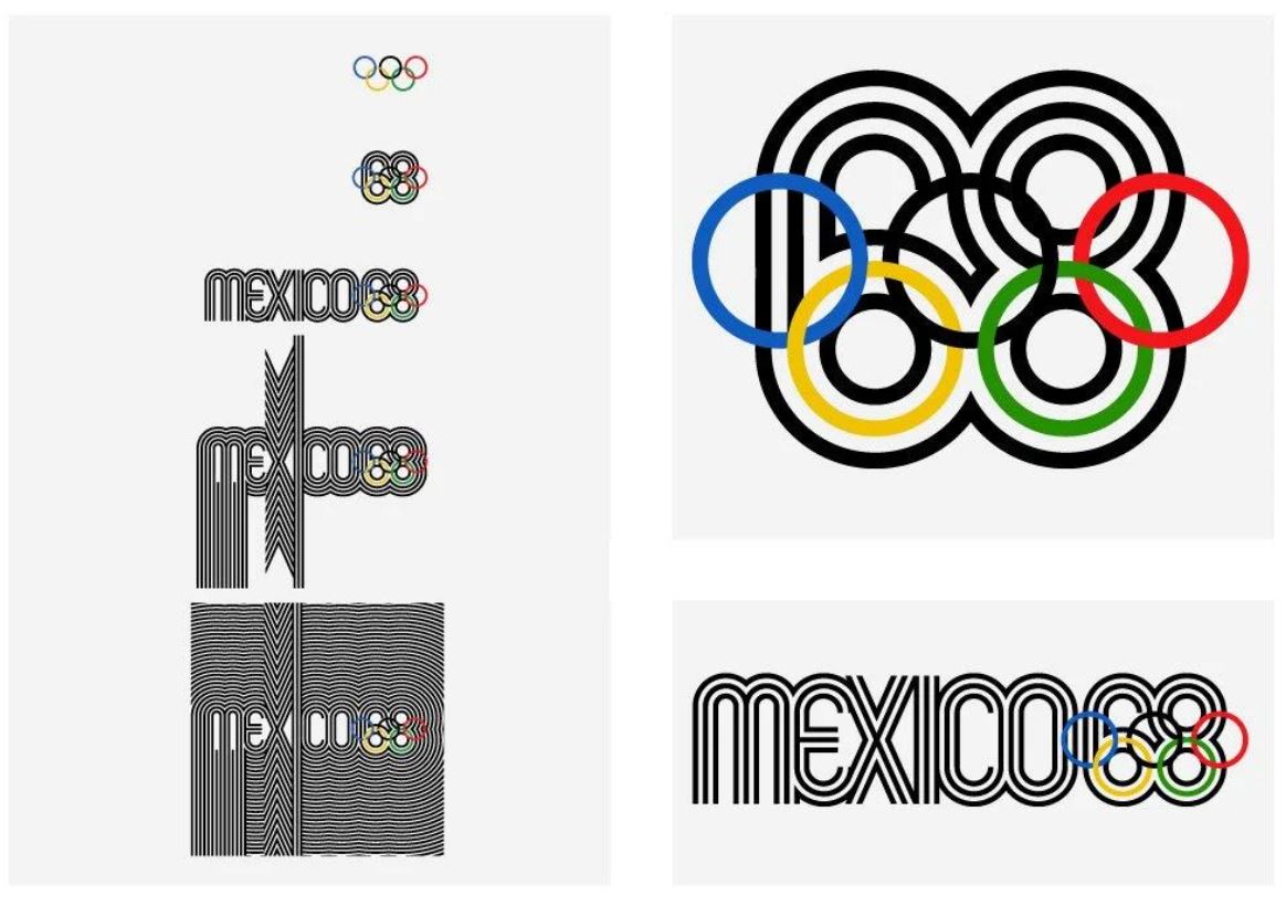
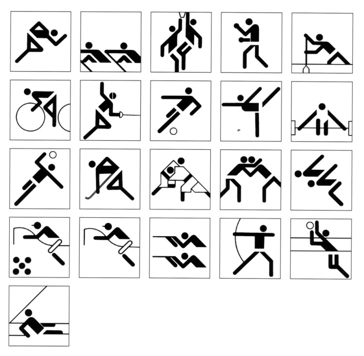
Both the Mexico ’68 and Munich ’72 Olympics employed a systematic approach in differing ways. Lance Wyman created Mexico’s brand with a clear system in place which could extrapolate to include the names of all the sports in a style which resembled historic ceramics of the country. Otil Aicher didn’t really look for visual stimulants to mirror the country’s aesthetics, but instead used a grid based system (which he had learnt from Bauhaus) to create a feeling of the German nature – regimented, strong and precise.
Emblematic Approach


The above designs employed an emblematic approach with easily identifiable aspects that the viewer would associate with the country. As an example, Michael Bryce used a boomerang, the Sydney Opera House and aborigine art stylings to visually induce a sense of place.
Abstracted Approach
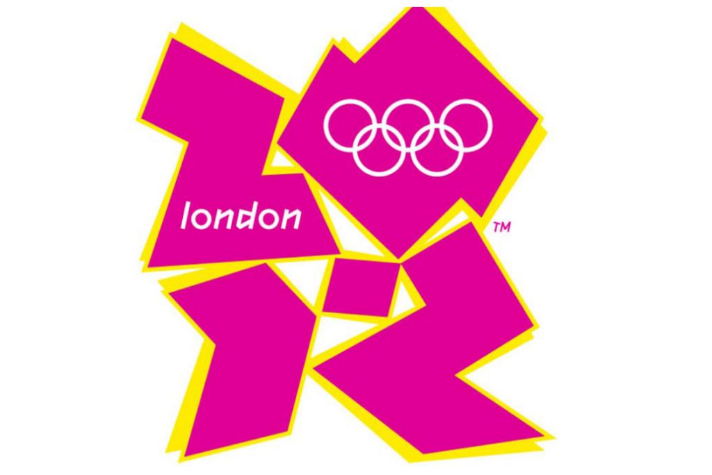
2012 introduced a new style to the arena of Olympic logo design – abstract. Nothing in the logo, designed by Wolff Ollins, is inherently English or represents the capital. I personally feel that, because the Olympics is now so well known, it enables designers to artistically create designs which will become synonymous with the hosting country. It used to be that the host country would help define the logo. Now it’s like the logo defines the host country.
Olympics > Host country > Logo
Olympics > Logo > Host country
Fake News
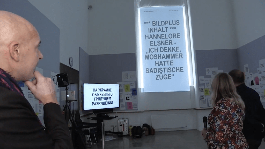
The installation in London by Patrick Thomas called Breaking News 2.0 questions the truth in headlines. It offers no solutions to spotting fake news, but instead starts a conversation about the subject. Thomas does this by sourcing headlines from around the world via RSS feeds and inviting people to create their own headlines. These are then randomly shown on the screen with overlaying symbols and graphics.
This video had me asking several questions:
- Are headlines more believable when seen with other images or symbols?
-
Do people read different things, depending on their own culture, beliefs, upbringing etc?
-
Why did Asian people seem more interested? Is news / fake news more prevalent in their culture?
Ideas Wall
Workshop Challenge
Case Study 1: Take one story to see how it is reported globally. Collect three versions of the same story from three different countries. How is it reported? Headline? Text? Unpacking meaning and distorting meaning.
Case Study 2: Take a brand and look at how it is delivered in different countries, e.g. alcohol, tobacco, transport, cars. Is it symbolised in a different way? Why might colour or typeface have been changed? Does it work at a local level and does it work at a global level?
Task: Please explore Case Study 1 or 2. Collect visual examples and upload onto your blog and onto the ideas wall. Debate your opinions with your course mates – ensure you contribute and incorporate this into a short 500 word written critical review in your blog. Consider the impact the media has on your understanding of visual signs and symbols relating to that piece.
These case studies explore how society is manipulated by a message and how graphic design is deployed.
Case Study 1: Covid across the world


I looked into the first case study and examined how Covid-19 was reported on across the world. The thing that surprised me the most was the amount of finger pointing and the blatant racism in some of the headlines. French newspaper, Courrier Picard, used the headline, “Yellow Alert” and followed it up with an editorial entitled “The Yellow Peril”. How can this be allowed?
Case Study 2: Unilever’s Heartbrand


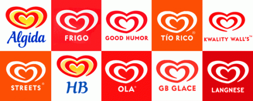
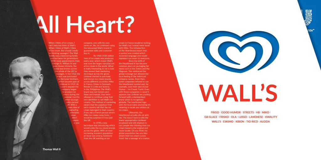
When researching brands which have different messaging across the world I came across Unilever’s Heartbrand. Innocently, I always thought that Wall’s had globalised and that the other names for it sat under Wall’s. Was this right? This really peaked my interest and I decided it was worth exploring for this week’s workshop challenge.
Not just Wall’s
When I think of ice cream, I can’t help but think of Wall’s. When I think of Wall’s I think of ice cream. But should I really be thinking sausages? The Wall family was a butchering family and had been for generations. With royal appointments from George IV, William IV and even Queen Victoria, the name was known across the whole of the UK for sausages. In the 1922 the brand was purchased by the Lever brothers, which became part of Unilever in 1929. At Lever’s request the company began to produce ice cream during the summer months when sausage sales slacked off. With a keen idea of marketing principles Lever didn’t create a new company, one with his own name on. No, he continued using the renowned Wall’s brand to guarantee sales and customer buy in.
By 1960 1920 million tons of ice cream was produced every year, which meant Wall’s was now the larges manufacture of ice cream in the world. What is really interesting to me is how they moved their marketing technique across the globe. Unilever started to purchase well known ice cream brands across different countries: Miko in France, Frisko in Denmark, Bresler in Chile and Selecta in the Philippines. The Wall’s brand was not forced upon them and instead, they were allowed to continue using their own identities to sell Wall’s ice creams. This method of marketing meant that the populous from each country felt that the ice cream belonged to their country. If you ask a French person where Miko ice cream come from, I would be surprised if they said the UK.
In 1998 a new technique was introducing which would unite the ice cream brands across the globe. With an ever-increasing transient population an issue was arising. Someone from the UK wanting an ice cream in France would be looking for Wall’s but instead were faced with Miko. The introduction of the Heartbrand meant that a symbol was created which traversed language and would represent ice cream to everyone.
Since the birth of the Heartbrand it has become common place on packaging for items such as the Solero and the Magnum. This reinforced the global message but allowed the local feeling of the individual company names. Even then, some companies refused to use the Heartbrand symbol and, for example, used their own (Good Humor – Ice Cream Truck). Even with those companies in mind it appears that Unilever are pushing forward with a standardised brand which is recognised globally. The heartbrand logo with the local name anchoring it’s meaning to locals and visitors as ice cream.
Ultimately, the Heartbrand actually sits ok with me. The issue I have is with the brand appropriation Unilever employed and still employs to con people into thinking their ice cream brand is the original and made locally. Do you think the global population has any idea where their ice cream comes from? Not a sausage of a chance.
Editorial Piece
Personal Reflection
For me, this week has made me think about symbology in a new way. I think anything can become a symbol if marketed correctly over a period of time. Recently, I would argue that symbols ingrain themselves in society relatively quickly as logos or brands. Some can come into existence, be recognisable to society and disappear within a matter of years or months.
In fact, historically, words and characters were really the only way to portray your message. To communicate. With the rise of design and of the brand, this process has changed significantly. We still use of knowledge of pre-existing icons, indexes and symbols but, as a whole, have learnt a new set of codes which include, colour, shape, form and space to signify emotions and meaning quickly.
Further to this, identity, whether it be of a brand or a county / culture can now be signified by systems, emblems or even at a push – abstracted forms. In an age where speed is king, recognition of these devices has become quicker and quicker and the giants of the branded world have taken notice.
Unilever wants you to recognise the Heartbrand wherever you are. However, they also want you to feel some sort of local recognition with the name of the product, so have bought local brands and manipulated the use of their name and brand recognition for their own gain.
Although my research into Wall’s has shown me only one example of brand appropriation and symbolic trickery, I will now be more observant to the world of symbols and their uses around me.
…and whenever, wherever I take that first bite of an ice cream I will now and forever think of sausages.
References:
BBC (2016) Adam Curtis: Hypernormalisation [online video] Available at https://vimeo.com/191817381 (Links to an external site.) [Accessed 23rd September 2019].
Crow, D., (2003) Visible signs: An Introduction to Semiotics (Links to an external site.). AVA, London.
Heller S., (1999) Design literacy (Continued) Understanding Graphic Design (Links to an external site.). Allworth Press, New York.
The Meaning of Hand Gestures Around The World. Chris Mille. Ef English Live. Available at: https://englishlive.ef.com/blog/english-in-the-real-world/hand-gestures/ [Accessed 20/01/21]
Icon, Index and Symbol. Website. Vanseo Design. Available at: https://vanseodesign.com/icon-index-symbol/ [Accessed 20/01/21]
The best (and worst) Olympic logos in history. Luke Trayser. Website. Available at: https://medium.com/collaboration-room/the-best-and-worst-olympic-logos-in-history-49aab6b9f6a4 [Accessed 20/01/21]
Coronavirus Website. Available at: https://www.usnews.com/news/best-countries/articles/2020-02-07/how-the-global-media-covered-stories-about-the-coronavirus-outbreak [Accessed 20/01/21]
Coronavirus Website Available at: https://www.theguardian.com/world/2020/mar/24/a-national-emergency-how-the-uk-papers-covered-the-coronavirus-lockdown [Accessed 20/01/21]
Coronavirus Website Available at: https://www.spiegel.de/international/europe/europe-can-t-afford-to-alienate-the-uk-after-brexit-a-6884d32f-d36d-40fa-bf1c-d74a7eb632f2#bild-48ac7fb9-5e34-4294-9da4-d8b82b0e98c1 [Accessed 20/01/21]
Coronavirus Website Available at: https://www.euronews.com/2020/04/17/how-are-europe-s-front-pages-covering-the-covid-19-pandemic [Accessed 20/01/21]
Brand name Changes. Website. Available at: http://clearwordstranslations.com/language/en/10-brands-change-their-names-for-local-markets/ [Accessed 20/01/21]
Unilever heart brand. Website Available at: https://www.citma.org.uk/resources/the-same-but-different-how-unilevers-branding-lives-from-the-heart.html [Accessed 20/01/21]
New Zealand Walls. Website. Available at: https://www.ola.nl/home.html [Accessed 20/01/21]
Australia Walls. Website. Available at: https://www.streetsicecream.com.au/about-streets.html [Accessed 20/01/21]
Walls. Website. Available at: https://www.wallsicecream.com/uk/about-walls.html [Accessed 20/01/21]
Independent. Website. Available at: https://www.independent.co.uk/life-style/companies-control-everything-you-buy-kelloggs-nestle-unilever-a7666731.htm [Accessed 20/01/21]
Wolff Olins. Website. Available at: https://www.wolffolins.com/case-study/unilever/ [Accessed 20/01/21]
BBC. Website. Available at: https://www.bbc.co.uk/news/magazine-30729480https://www.dictionary.com/e/emoji/eggplant-emoji/#:~:text=The%20eggplant%20emoji%20is%20also,in%20the%20UK%20and%20Japan.&text=When%20paired%20with%20the%20mouth,droplets%20emoji%2C%20it%20means%20ejaculation.https://3signs.co.uk/product/no-children-safety-sign/https://indexgrafik.fr/rhetorique-de-limage-roland-barthes/ [Accessed 20/01/21]
Olympic Logos. Website. Available at: https://www.dezeen.com/2016/08/08/olympics-logo-designs/ [Accessed 20/01/21]
Unilever Brands. Image. Available at: https://en.wikipedia.org/wiki/List_of_Unilever_brands [Accessed 20/01/21]
Heartbrand Logo. Available at: https://logos.fandom.com/wiki/Heartbrand#:~:text=It%20can%20be%20traced%20back,this%20design%20have%20been%20introduced. [Accessed 20/01/21]
Leave a Reply