Intrinsically Place Based Typography
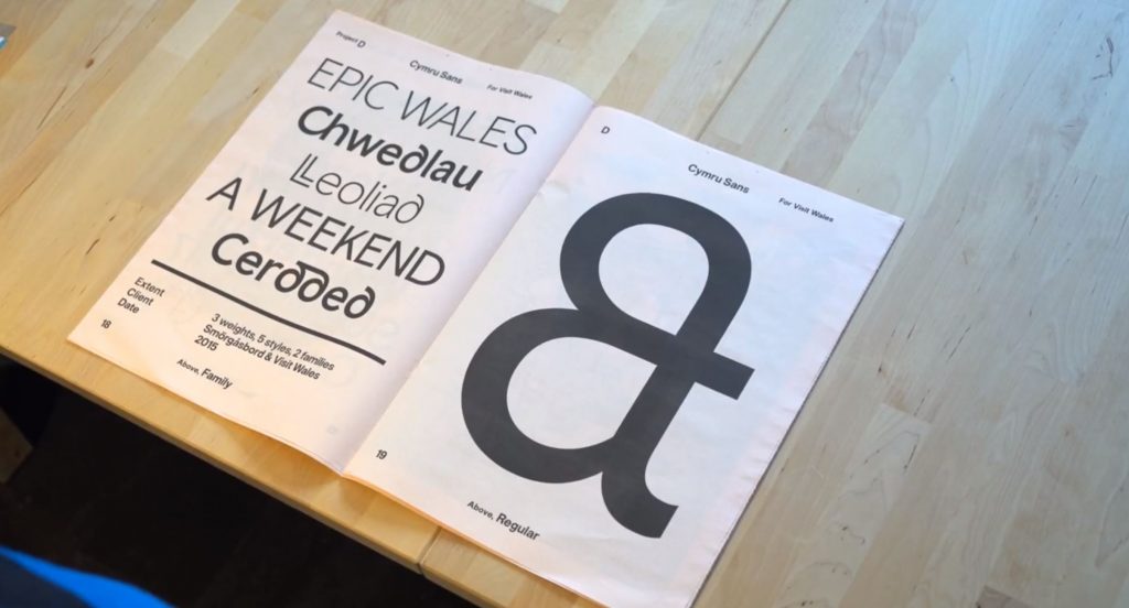
This week’s lecture explored the idea of place and typeface. Colophon Foundry and Smorgasbord worked in partnership to create the below typeface for Wales.
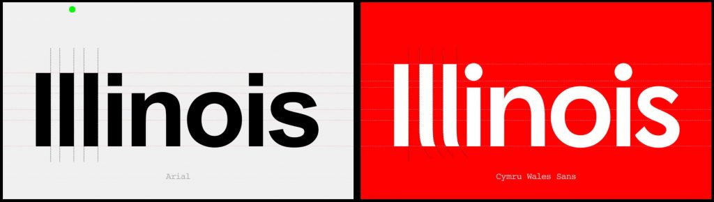
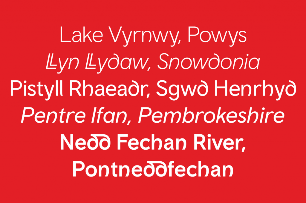
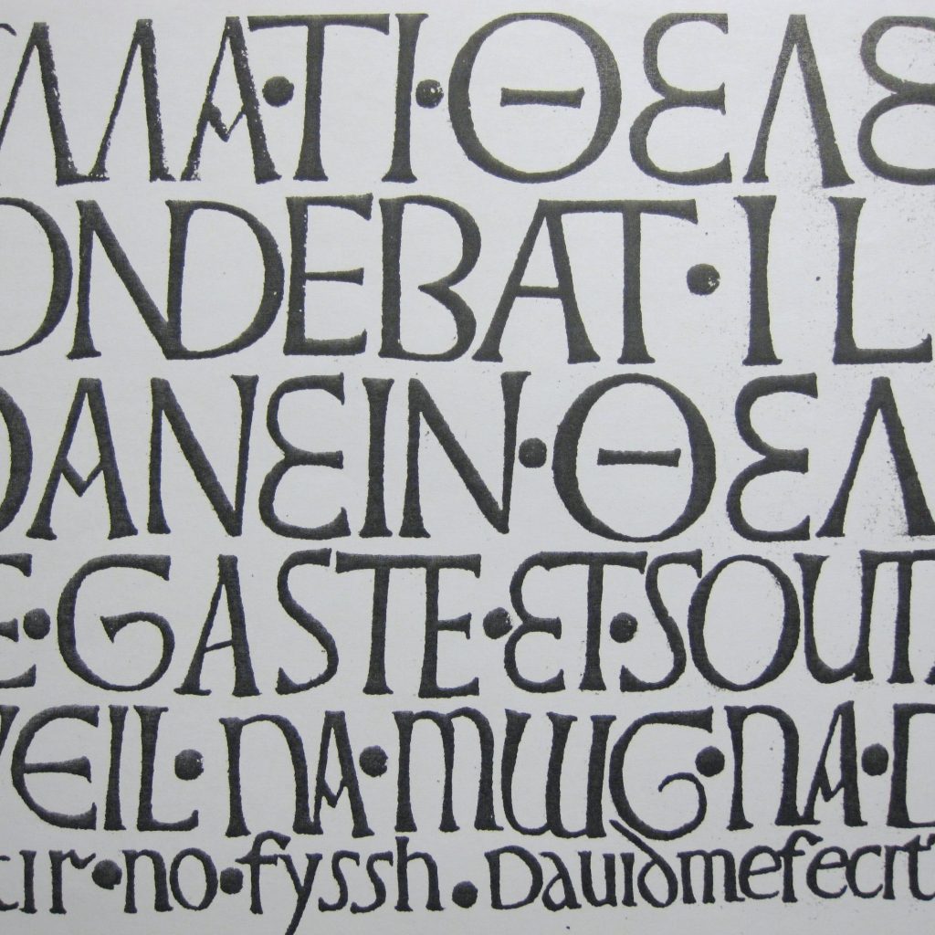
They wanted to create something which was intrinsically welsh and researched the countrie’s rich, cultural heritage which can be seen below.
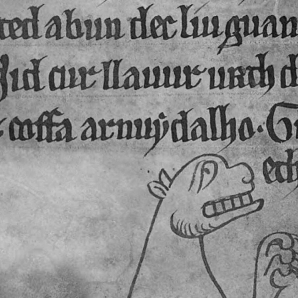
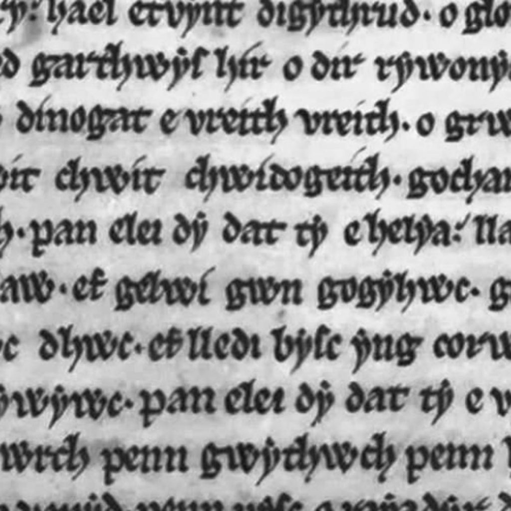
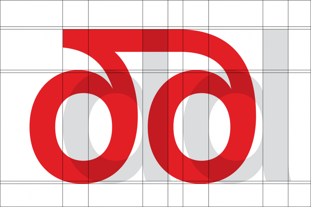
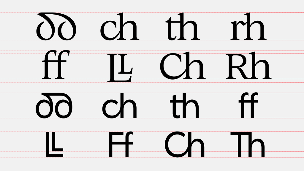
By studing the countrie’s history Colophon Foundry identified some key facets which made up the face’s ‘welshness’. These included the harp, or decorative arc, seen in letters with long stems and the di-graphs of certain sounds such as dd(th) or LL(f).
“Our aim with the Cymru Wales font family was to create contemporary European typefaces with a unique personality and a ‘sense of place’ baked in. The key to the latter were the eight digraphs (unique letter combinations) that feature in the Welsh alphabet as well as the curved ‘d’ character that has quickly become the cornerstone of both the Sans and Serif.” – Colophon Foundry
As a side note – I really liked how they decided to record the font and display it the client (see below). The use of the newspaper gives it a texture, history and an idea of its application in a way most befitting of a typeface created from history.
Olympic Games
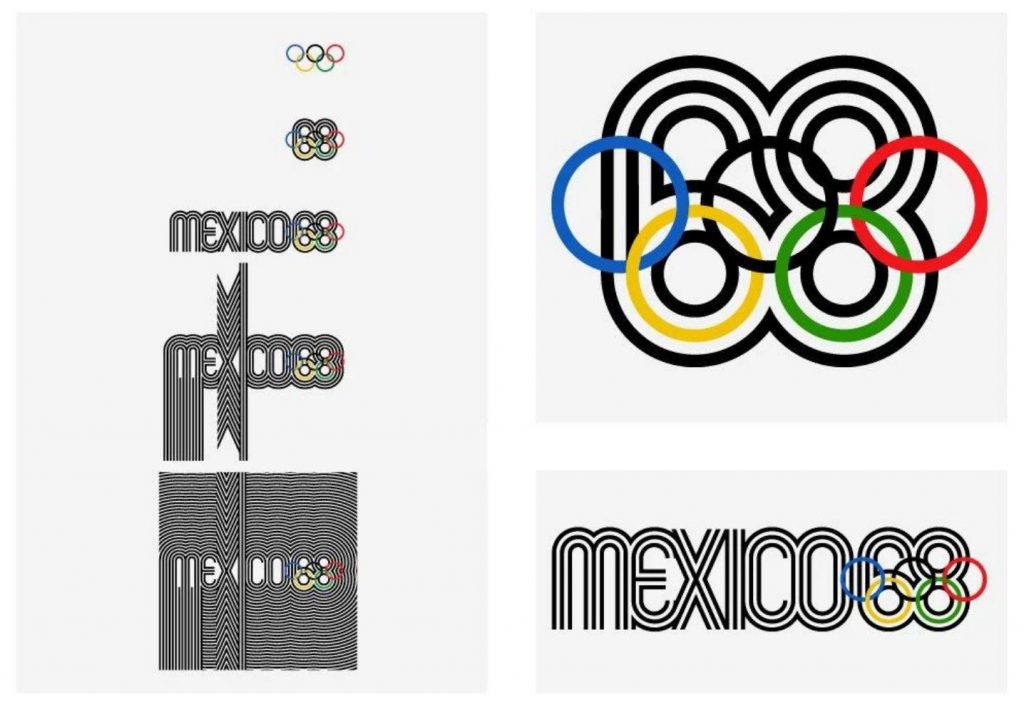
Another case study highlighted in this week’s lecture was that of Lance Wyman’s 68 Mexico Olympic branding. Similar to Colophoon Foundry he wanted to utilise the countrie’s rich cultural heritage to produce something that would resonate with the host populous. The logo and subsequent brand had to be something which traversed language and was easily recognisible.
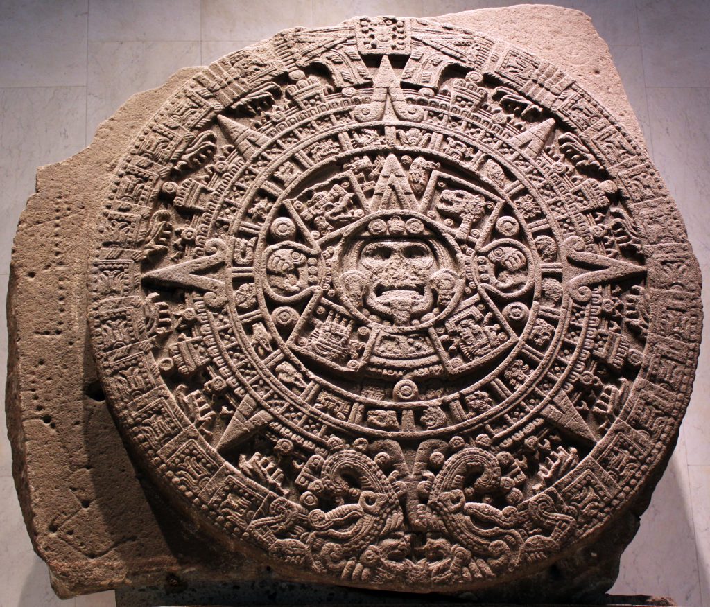
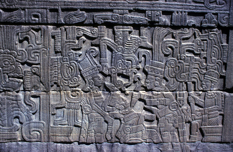
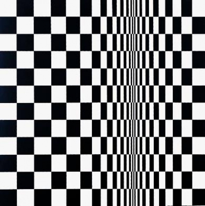
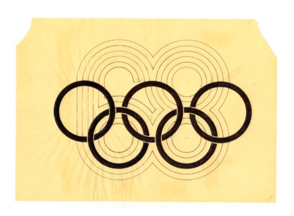
Wyman used Aztec and Mayan refernces to draft his initial idea. He also pulled ideas from the popular art movement of Optical Illusion Art, or Op Art for short. The old and the new combined to create a brand with a sense of movement which had the building blocks in place to extrapolate its key points into a wider context.
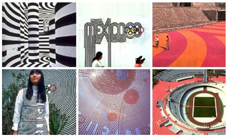
The parallel lines became iconic and recognisable instantly – even from a small section. It was this pattern that allowed the brand to be replicated across the games to great effect. With such a strong symbol in place Wyman was able to use iconography and silhouette to cross language barriers without effecting core messages.
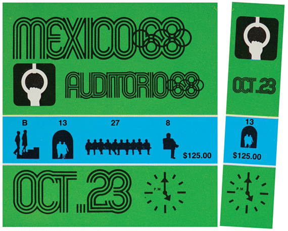
A ticket stub below shows how the three elements of logo, silhouette and pattern combined to create an Olympic Games rooted in Mexican history.
Exploring Method
This idea of sign painting and lettering which i acknowledged last week in my research into ghost signs intrigued me. I have been following Jame Lewis, a Graphic Designer and hand lettering expert, for many months and his style resonated with me. I want to include ‘old’ meeting ‘new’ in way similar to how Wyman did with his Aztec / Op Art brand.
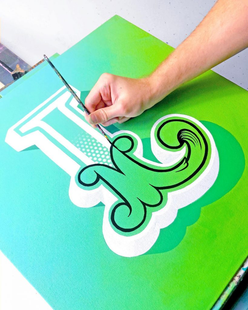
The skill involved in James’ design pieces is no less refined than those who used to paint brand on the side of buildings. The physical activity of painting by hand gives the pieces a sense of depth, texture and form which is hard to replicate digitally.
Below is a video from Lewis who is painting a logo onto the bonnet of an expensive car. One slip and he may have to start over! I admire his patience and skill with such a precise and historic art form.
Something a Bit More Free
Another artist who I follow on Instagram is Snooze One. Based in Berlin, Germany he found inspiration from graffiti. He has now turned this into an art form in its own right, where he has become proficient at creating digital artworks which appear as if physically made. I personally believe that design has become a bit flat in recent years and it is experiments in texture, paint and print which will be a strong basis for its future.
Ideas Wall
Workshop Challenge
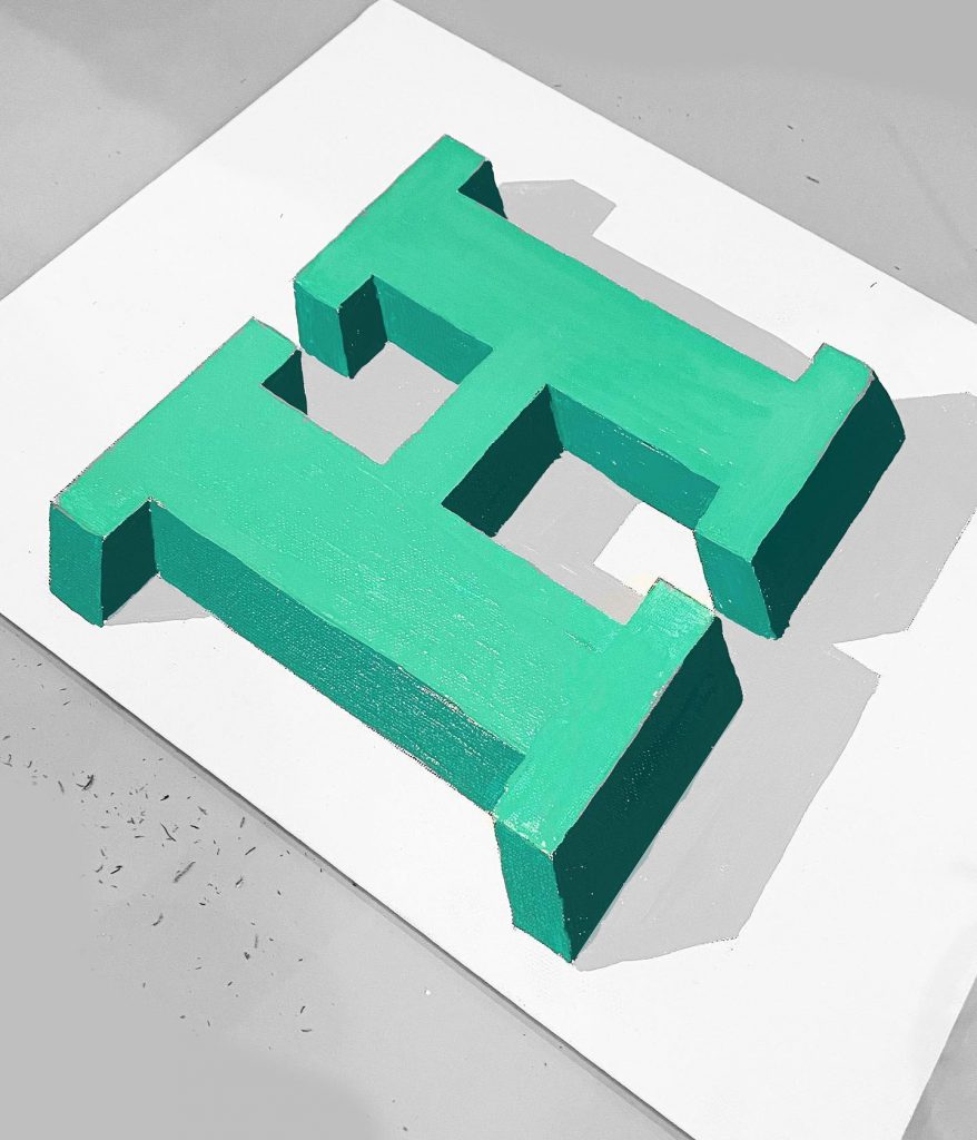
This week we want you to use your visual research into letterforms from Week 1 to create a new and unique piece of illustrative typography. Do not forget to document your visual developments, and be experimental with form and legibility to create something entirely new.
Use the DNA of your initial visual research from Week 1 to create a new and unique piece of typography that spells out the name of your town or city.
Your new title lettering should reflect the identity of your town or city.
Consider the interplay between provenance and historical story, in contrast to more strategic alignment to a design’s positioning.
To the Sketch Book
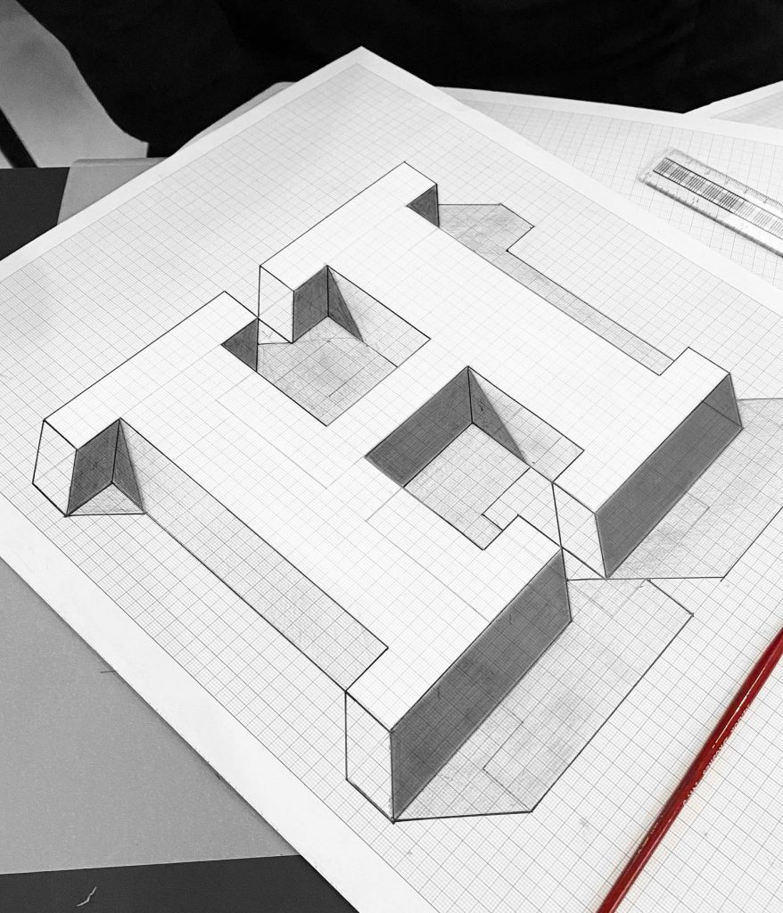
I wanted to start this project phsically. I am not always the best at sketching ideas but felt it was important to use a method which has been around for centuries.
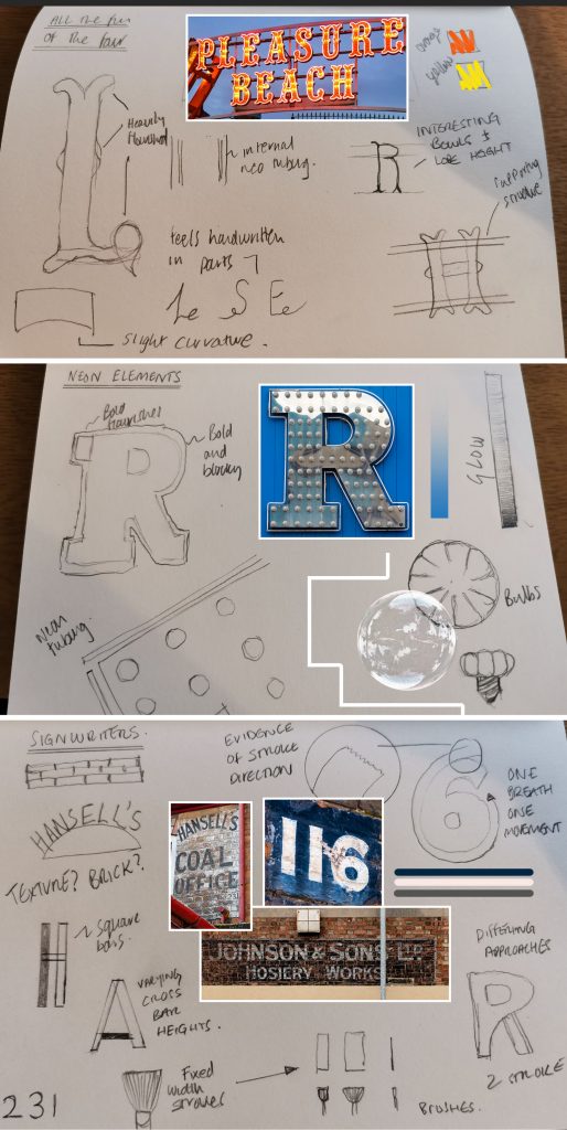
From each of the pieces above I really tried to capture each of the typeface’s unique qualities. For me they are:
- Pleasure Beach – Flourishes, LED lighting, mounted lettrs, bright colours and a slight bottom curvature.
- Silver Slipper – Neon tubing surrounding the letter, glass bulbs and a sense of glowing
- Ghost Signs – One breath, one stroke, simple lettering, curved forms, black and white colours with a non-uniform approach
Refinement and Practice
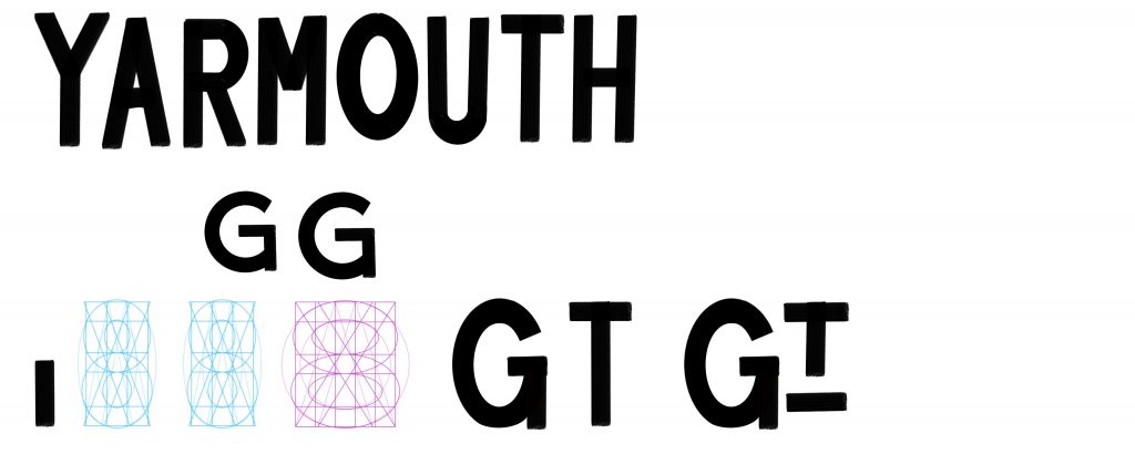
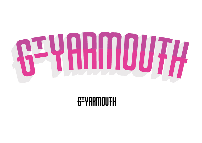
I started byusing my iPad and Apple Pencil to create some letter form which represented the history of typefaces in Great Yarmouth. I focussed on using one stroke per movement and keeping an elongated x-height.
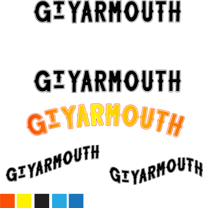
I felt my inital sketches did not include enough flourish that was seen in the Pleasure Beach font. I returned to Procreate to include centre ‘nuggets’ on each of the letters. I also surrounded them with a stroke to suggest the neon tubing. I made sure this stroke was applied in a way that the tubing would have been. I.e. not parting ways and in one continuous line.
I also experimented with glow and warp effects to give some sense of the seaside attractions that Great Yarmouth are known for.
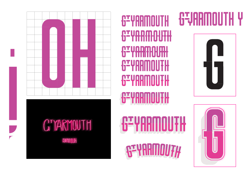
I really wanted to focus on how typefaces are created and continues to experiement with a gridlike form where textured strokes could be applied to create something truly “Great Yarmouth”.
Personal Relection
Got there in the end! I think this week was tough for me because I wanted to create something with a hand made feeling to it and that’s not really me! I like clean, straight lines and think, with my final piece, I have successfully marrier the two together.
In creating a place based type face it’s vital to look back. To recognise the place’s heritage and feeling. In doing so, you are able to create a face which oozes with the feeling of that location. As with Colophon Foundry and Lance Wyman, I looked backwards before looking forwards. I resarched ways in which the past is presenting itself today and appplied some of those principles to my designs.
By breaking down the found letter forms and identfying their unique characteristics, I was able to form a DNA of sorts which captured the essence of Great Yarmouth. This would form a striking foundation for a brand going forward and could be extrapolated into many facets of design.
I would really enjoy having months and months to play with this subject and the final piece, but in reality I need to take what I have learned and apply in my future studies.
Overall, I think this has been one of my favourite week’s of the course and look forward to expanding my development going forward.
References:
https://imjustcreative.com/1968-mexico-olympics-logo/2019/04/03
https://99percentinvisible.org/episode/mexico-68/
Grey London (2014) Dan Rhatigan on Ryman Eco (Links to an external site.) [online] 20 August, (Accessed: 7th December 2018)
99% Invisible (2017) Mexico 68 (Links to an external site.), [podcast] 27 June, (Accessed: 7th December 2018)
Typo Labs (2017) Dan Rhatigan | Variable Fonts: Progress Report (Links to an external site.), [online] 6 April, (Accessed: 7th December 2018)
Creative Review (2018) The CR podcast episode 14: Making, changing and documenting places (Links to an external site.), [podcast] 1 November, (Accessed: 7th December 2018)
Foundry, C., 2021. Wales — Colophon Foundry. [online] Colophon Foundry. Available at: https://www.colophon-foundry.org/custom/wales/ [Accessed 14 May 2021].
Foundry, C., 2021. Smörgåsbord. [online] Smorgasbordstudio.com. Available at: https://www.smorgasbordstudio.com/work/cymruwalestypeface/ [Accessed 14 May 2021].
Wagner, J., 2021. Lance Wyman Designer 1968 Olympics. [online] Olympic-museum.de. Available at: https://www.olympic-museum.de/design/lancewyman/wyman.php#:~:text=It%20was%20designed%20by%20integrating,the%20Games%20were%20in%20Mexico. [Accessed 14 May 2021].
Smith, L., 2021. 1968 Mexico Olympics Logo and Brand Identity | The Logo Smith. [online] The Logo Smith. Available at: https://imjustcreative.com/1968-mexico-olympics-logo/2019/04/03 [Accessed 14 May 2021].
Lewis, J., 2021. Hand Lettering Tutorial. [online] Youtube.com. Available at: https://www.youtube.com/watch?v=IfMxcaGK-00 [Accessed 14 May 2021].
Lewis, J., 2021. James Lewis. [online] Instagram. Available at: https://www.instagram.com/jamesllewis/?hl=en [Accessed 14 May 2021].
One, S., 2021. Snooze One. [online] Snoozeone.com. Available at: https://snoozeone.com/ [Accessed 14 May 2021].
One, S., 2021. Snooze.One. [online] Instagram. Available at: https://www.instagram.com/snooze.one/?hl=en [Accessed 14 May 2021].
Grey London (2014) Dan Rhatigan on Ryman Eco (Links to an external site.) [online] 20 August, (Accessed: 7th December 2018)
99% Invisible (2017) Mexico 68 (Links to an external site.), [podcast] 27 June, (Accessed: 7th December 2018)
Typo Labs (2017) Dan Rhatigan | Variable Fonts: Progress Report (Links to an external site.), [online] 6 April, (Accessed: 7th December 2018)
Creative Review (2018) The CR podcast episode 14: Making, changing and documenting places (Links to an external site.), [podcast] 1 November, (Accessed: 7th December 2018)
Leave a Reply