The Role of Language in Design
Designers are often thought of as visualisers of language. However, there is a whole genre of Graphic Designers who also write. This can be seen in manifestos, books and periodicals that were published to question ideaologies on modern art.
Before WW1 there was a high level of widespread civil unrest. This unrest lead to questions being asked about a various ‘accepted behaviours and norms’, including that of what constituted art. The next few pages will look at some of those questions and the resultant answers which took the forms of movements and manafestos.
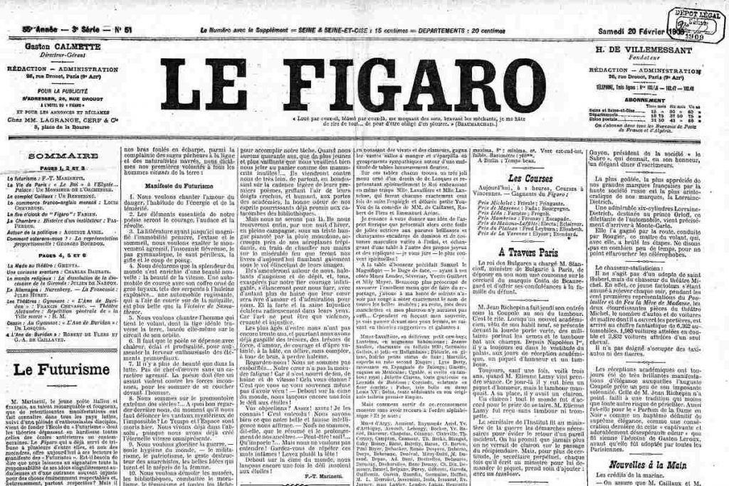
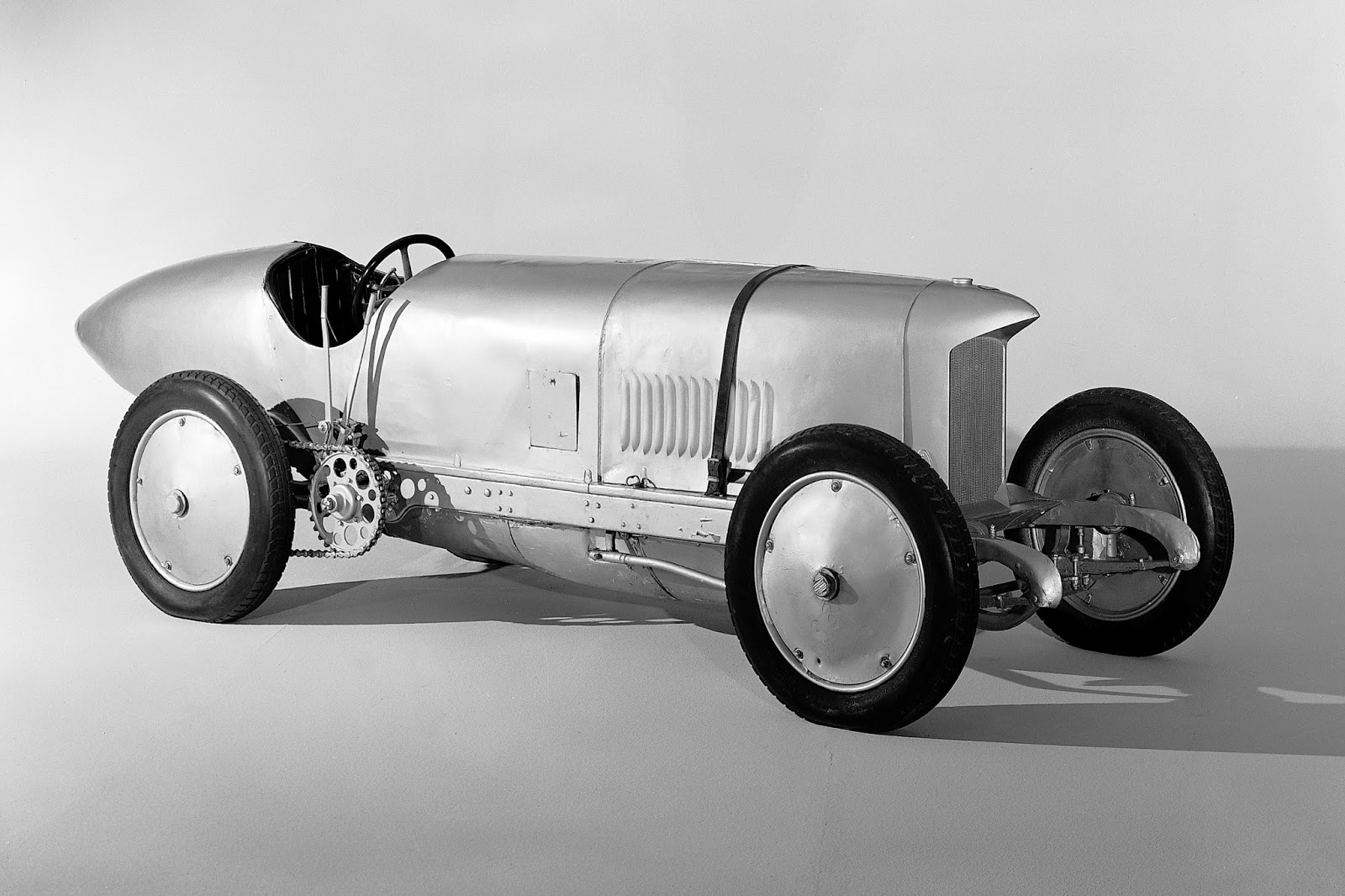
Italian Poet, Filippo Tommaso Marinetti, published his manifesto of Futurism in 1909 in France. The location was of vital importance as France represented and symbolised traditional fine arts.
The Futurists proposed a world in which art celebrated modernity through depcitions of industry and technology.
The two images here shows the enormity of change which the Futurists wanted to reflect. With advancements in transport, design and architecture, art was still considered in terms of its aesthetics of old.
Marinetti said in his manfesto, ‘we will free Italy from her innumerable museums which cover her like countless cemeteries’.
This movement is cyclical even today and artists and designers focus on the now and the future to influence their work.
Looking forward and not back became an exciting new venture for the world.
Vorticists
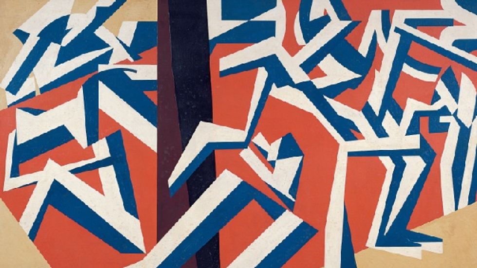
Artist and writer, Wyndham Lewis, was also inspired by the speed of change and created the Vorticist movement in 1914. Rather than focussing on tangible representative depictions of the modern world, the Vorticists created ‘cubist fragments of reality derived from the machine and urban environment.’
This movement was born in London, weeks before Germany invaded Belgium. However, those practicing this style had done so for a year previous to its announcement. It was a culmination of cubist and modernist beliefs which would ultimately live a short life.
By 1919 the movement had been lost and categoriesd into other, more globalised art styles.The Vorticists: Manifesto for a Modern World, was one which is often referred to as being ill-definined. Maybe a reflection of the uncertainty that faced the world.
De Stijl
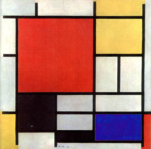
Widely considered as the most influencial of this time period is that of the Dutch movement De Stijl developed by Theo Van Doesburg in 1917.
A complete break from traditional art, this movement focussed on reduction of form and colour to produce modern abstract art.
Like most movements during this period, the De Stijl wanted to reinvent what was considered art. Most notiably though, they focussed on clarity and precision and has links with the world of Graphic Design we know today.
The ideas were published in a journal which optimised their beliefs. It has a clear sense of movement where the viewer is directed around the page.
In this edition, only the cover was ‘designed’ and I believe this was to show how art/design could live in harmony in what would later form the foundations for graphic design.
Die Neue Typorgraphie
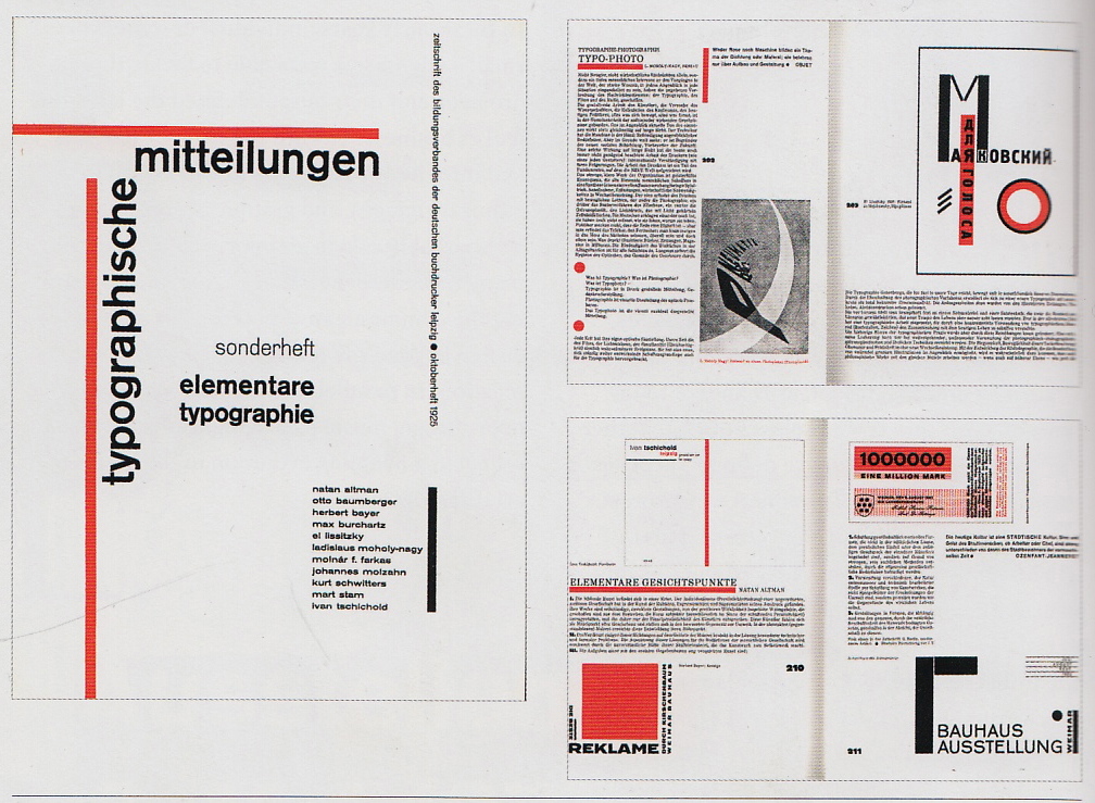
Following the end of WW1 the unrest in society continued to birth further art and design movements.
The New Typography, or Die Neue Typographie movement, combined information, design and art into a coherent set of principles.
Jan Tschichold, a German typographer and book designer who, in 1923, converted to Modernist design principles after exposure to Russian constructivist art and visiting the first Weimar Bauhaus, the revolutionary art, design and technical university.
His book was published in 1928 and was extremely popular with typographers and printers. The rules set out in this book would continue to influence graphic design even today.
Tschichold would eventually retract his belief system, claiming it was ‘too extreme’ and ‘inherently fascistic’.
I am glad he did this because it was an expression that his book was not a sacred text and that design and art are all about freedoms.
Regementally applied rules will only restrict a possible outcome which would only be negative for society.
Don’t get me wrong – I love this style and use some of the principles on a daily basis. Its just nice to be able to mix in something different!
International Typographic Style
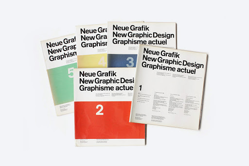
Visual revolutions entered the world of graphic design in the 1940s when designers Josef Müller-Brockmann and Armin Hofmann introduced a style that favored simplicity, legibility and objectivity.
The publication Neue Grafik had 18 issues between 1958 and 1965 and it was this magazine which outlined this revolutionary approach. Based on fundamentals taught at the Bauhaus, this movement would go on to establish a more in depth definition, focussing on the subtleties and details which would lead to clear messaging.
Swiss style has now become so commonplae that some would just class it as design. It would be impossible to provide a bisually stimulating and successful outcome without infringing on some of the principles set out in Neue Graphic.
The right shows some of Paul Rand’s work, an American Graphic Designer who used these design principles to establish some of the most recognisable brands across the world.
Clear, concise and legible – perfect for mass communication and marketing. Why wouldn’t it grow to be the industry standard we use today?
Unit Editions
Adrian Shaughnessy has written a multitude of books about graphic design and visual culture, ranging from Sampler, a series of three books that documented contemporary design for music, which he created while working at Intro, to the hugely popular How to be a Graphic Designer without losing your soul, a practical guide on how to succeed in graphic design.
Tone of Voice
With the revolution of imagery that came about from the early 19th century, literacy followed suit with differing styles establishing themselves as genres.
A short horror story has a completely feel to it than that of a chlidren’s story. As liertacy levels improved and design and information started to convene, bold new combinations were created to heighten the experiences for the reader.
Content
Format
Production
All of these can create an environment of wanting to read on. This is the aim of any publisher and each genre of text has developed over the decades to create industry standards which we expect to see.
In the voice of a futurist, I always ask my self if there is a different, more exciting way to engage the viewer. The next couple of pages will explore tone of voice and how it can be enhanced by production.
A modern children’s book represents the culmination of author, illustrator and designer coming together in a way which encourages a child to pick up their book. They are written in plain English with a playful, conversational and onomatopoeic prose which gives the words character and voice. Often the typesetting is made up of various typefaces, throwing caution to the wind of traditional graphic design. Each word can vary in size and weight providing emphasis and volume in a fun way for the reader. The sentences themselves can be used as a tool to help with reading direction and are used in partnership with the illustrator’s creations. Depending on age, some publication houses employ various interactivity devices to increase engagement. For example, the “That’s Not My….” Series, published by Usborne, and intended for 0-18 month olds, has various tactile elements to each page to enhance early learning development and recognition of differing textures.
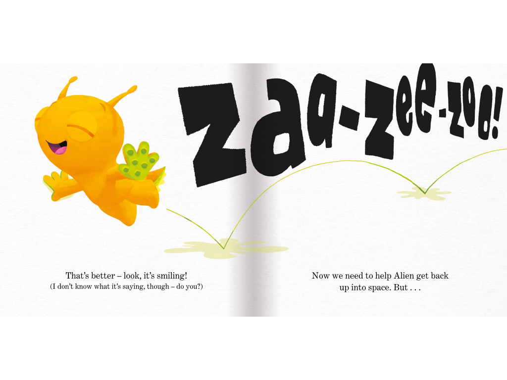
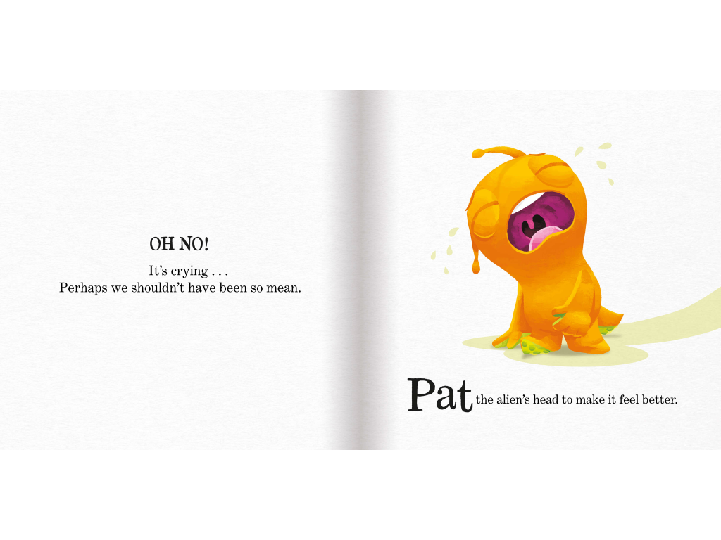
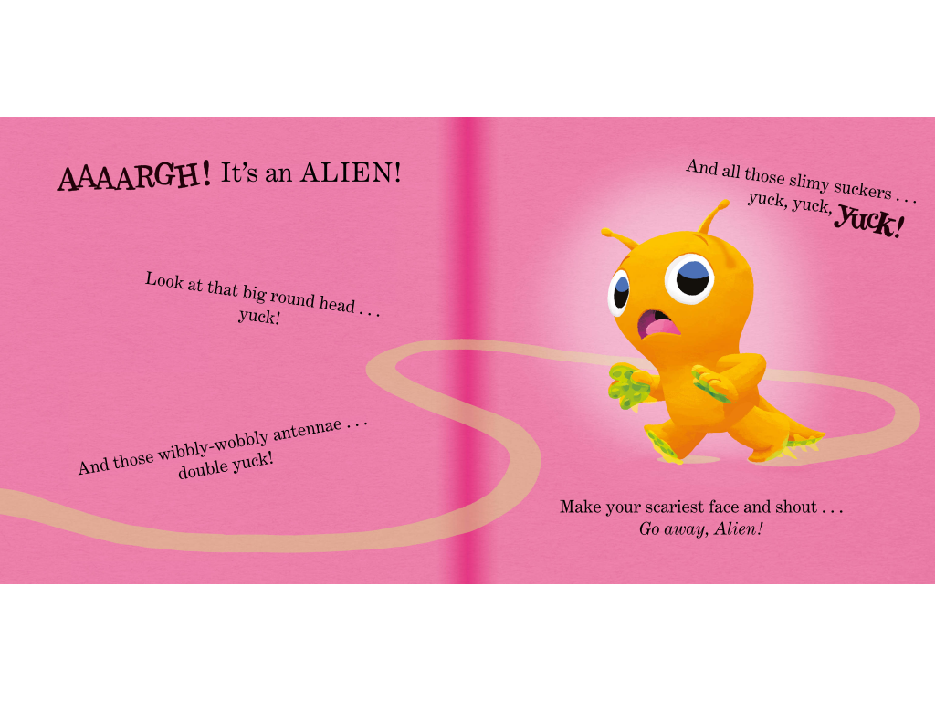
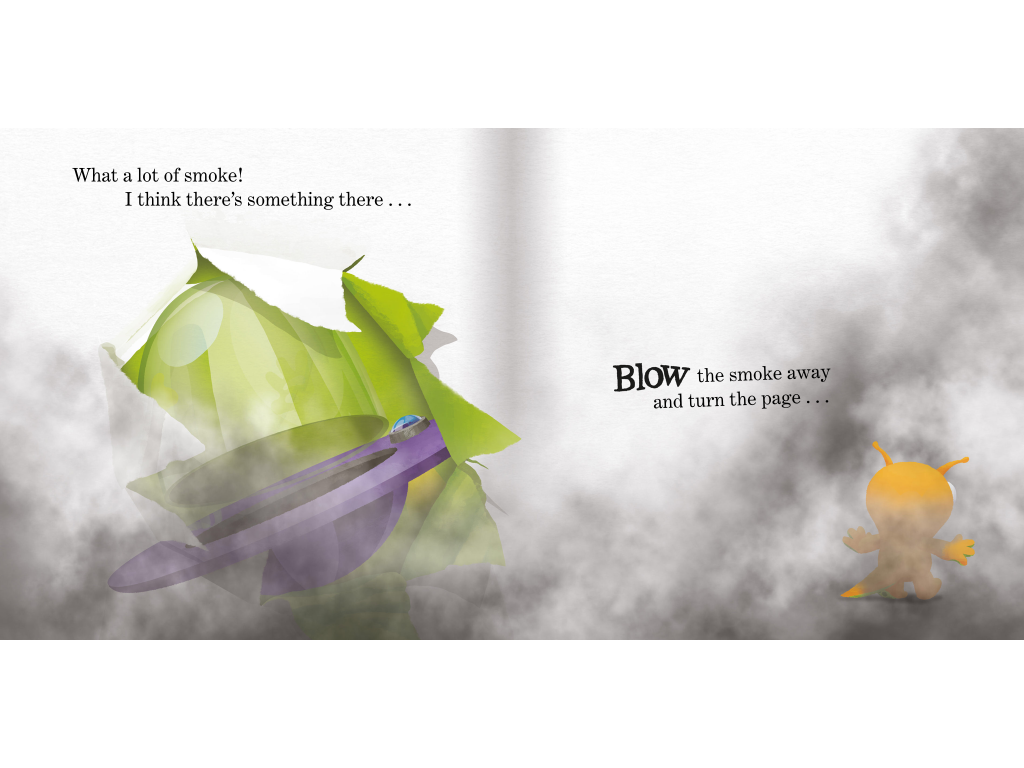
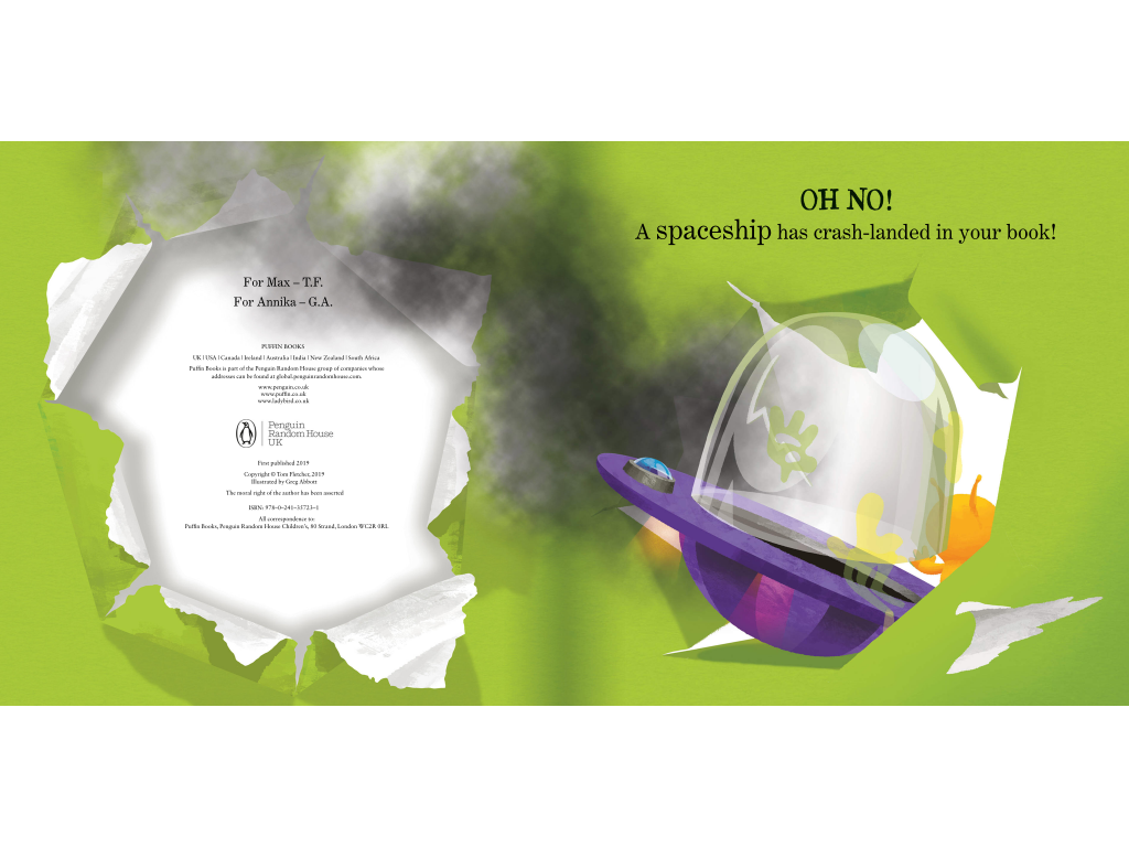
Tom Fletcher has created a series of books entitled, “There’s a … in Your Book”. He works with illustrator, Greg Abbott and publishers Puffin Books to create an exciting experience predominantly for 2-5 year olds. In, “There’s an Alien in Your Book”, the detail on each page is actually quite sparse. I believe this is done to enable the reader to place the alien in any environment and to create their own stories from the suggested text and character. Simple coloured or plain pages are used in conjunction with the character or text to amplify the meaning and tone of voice. Fletcher, like most authors, has his own style and nuances which make his stories stand out. In this book it is the use of humorous words, “wibbly-wobbly” or ones that have sound, “AAAARGH!” or “Yuck!”. This humanises his characters and talks to the reader in a conversational way. Children of this age have emerging language and imagination and the ‘less is more’ approach allows them to freely develop their own rhetoric within an accepted structure.
It wouldn’t be hard to imagine that publishing houses want to make money from their books, and in doing so may make sacrifices of creativity to keep costs down. Puffin have not chosen to employ any unusual print production techniques and rely on the effectiveness of the story, illustrations and design to win over their intended audiences. Ultimately, a successful children’s book is one that is picked up and read by children.
Analysis of modern Children’s Books
This represents my own take on a children’s book. To maximise its effectiveness, I have chosen to add ultra violet elements which encourage the reader to actively engage with the story.
They can use the affixed UV pen to find the ghost on the pages. On black pages he is quite visible, but on white ones you need to search with the pen to find him hinding.
I have used onomatoepic words which move around the page to make the book as fun and exciting for the children who are reading it.
I certainly think this is a book that my children would pick up and enjoy!
References
Designhistory.org. 2011. Italian Futurist & Expressive Typography. [online] Available at: http://www.designhistory.org/Avant_Garde_pages/Futurism.html [Accessed 14 May 2021].
Legendary-race-cars.blogspot.com. 2018. Benz 200hp aka Blitzen-Benz (1909). [online] Available at: https://legendary-race-cars.blogspot.com/2018/04/benz-200hp-aka-blitzen-benz-1909.html [Accessed 14 May 2021].
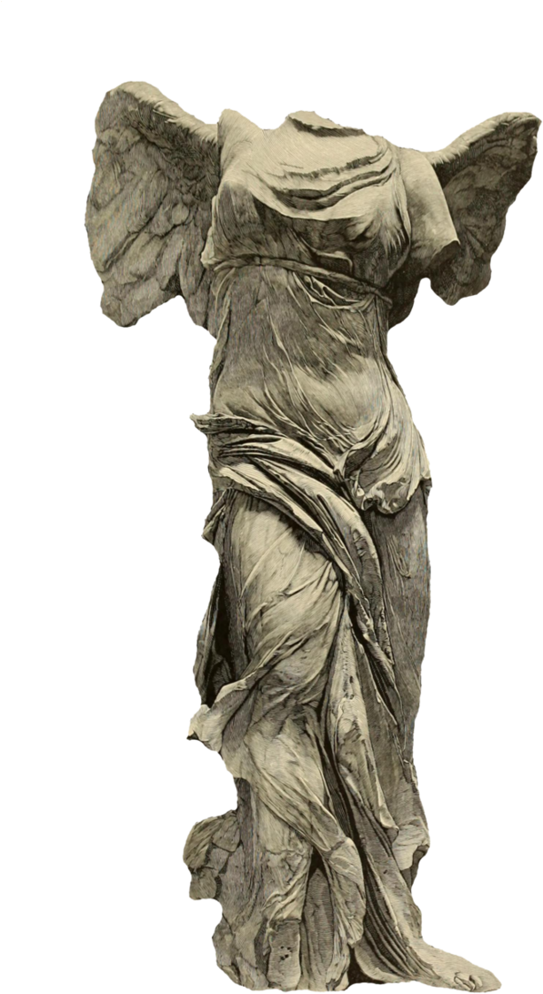
Le Louvre. 2021. Explore | The palace | A stairway to Victory. [online] Available at: https://www.louvre.fr/en/explore/the-palace/a-stairway-to-victory [Accessed 14 May 2021].
Duggan, B., 2011. How the Vorticists Defied the World (and Definition). [online] Big Think. Available at: https://bigthink.com/Picture-This/how-the-vorticists-defied-the-world-and-definition [Accessed 14 May 2021].
Estorickcollection.com. 2004. Blasting the Future! Vorticism in Britain, 1910-1920 – Estorick Collection. [online] Available at: https://www.estorickcollection.com/exhibitions/blasting-the-future-vorticism-in-britain-1910-1920 [Accessed 14 May 2021].
Wikiwand. 2021. De Stijl | Wikiwand. [online] Available at: https://www.wikiwand.com/en/De_Stijl [Accessed 14 May 2021].
www-personal.umich.edu. 2021. Jan Tschichold – Contribution. [online] Available at: http://www-personal.umich.edu/~aniciani/web_14/project2/contribution.html [Accessed 14 May 2021].
Budrick, C., 2020. Swiss Style: The Principles, the Typefaces & the Designers. [online] Printmag.com. Available at: https://www.printmag.com/post/swiss-style-principles-typefaces-designers [Accessed 14 May 2021].
Munari, N., 2013. Neue Grafik — Munari Design. [online] Munaridesign.com. Available at: http://www.munaridesign.com/culture/neuegrafik.html [Accessed 14 May 2021].
Graphéine – Agence de communication Paris Lyon. 2019. Paul Rand, everything is design! The man who changed the face of the USA. [online] Available at: https://www.grapheine.com/en/history-of-graphic-design/paul-rand-everything-is-design [Accessed 14 May 2021].
Unit Editions. 2021. Unit Editions. [online] Available at: https://www.uniteditions.com/ [Accessed 14 May 2021].
Amazon.co.uk. 2021. [online] Available at: https://www.amazon.co.uk/Theres-Alien-Your-Book-Fletcher/dp/0241357209 [Accessed 14 May 2021].
Fletcher, T. and Abbott, G., 2019. There’s an alien in your book. Puffin.
Leave a Reply